
We’ve updated the Aid Tracker. It now has information on NGO donations until the end of the 2014/15 financial year. (This is the most recent year for which there are data. You can find our updated charts at the bottom of this page on the Aid Tracker).[1] There’s good news for Australia’s aid NGOs–or most of them at least.
As you can see in the chart below, the total volume of donations to aid NGOs increased in both nominal and in inflation adjusted dollars between 2013/14 and 2014/15. Donations have now been increasing steadily since the 2011/12 financial year. What’s more, the most recent year’s increase was greater than previous years’. In inflation adjusted terms, total donations exceeded the 2004/05 peak for the first time in 2014/15.
Trends in total donations to aid NGOs

My colleague Ashlee Betteridge has also calculated donations per capita. Again you can see these data in the Aid Tracker. And there’s more good news to be had: after several years of little change, inflation adjusted donations/capita increased from $42 per person to $45 per person.
Comparing donations per capita and median household income data shows that between 1999/2000 and 2013/14 (the most recent year I could obtain median income data for) growth in NGO donations easily outpaced the growth in the median disposable household income. (Donations per capita were twice as high 2013/14 as they were in 1999/2000, median disposable household income was 1.31 times as high). (The source for household income figures is page 28 of this Melbourne Institute report.)
There are two ways the total volume of donations can increase: either more people donate, or the average donor starts giving more. Obviously, it would be interesting to know which of these two increases has driven up total donations, or whether the rise was a product of both combined. Alas, because we don’t have detailed data on donor numbers for earlier years, we can’t answer this question for the whole time period. However, for the last two years we do have data if we limit ourselves to Australian Council for International Development (ACFID) member NGOs (most of which provide detailed data to ACFID). The chart below shows average the size of the average donation for 2013/14 and 2014/15.
Inflation adjusted average donation size for 2013/14 and 2014/15

When you look at the chart please note that, to ensure I was comparing like with like, I based my calculations only on those NGOs which provided ACFID with donation and donor data in both years. I also excluded one large NGO whose information on donor numbers in 2013/14 appeared incorrect. (Some smaller NGOs may have had similar issues but they were too small to change overall findings. In the case of the large NGO in question, there were no issues with the information they provided on how much money they received, the issue was solely to do with donor numbers.) Also, the averages I’ve calculated are means, and are almost certainly pushed up by very large donations including bequests. I can’t calculate the median donation, but it was probably lower. Also note that the mean donation calculated here is, in effect, the average that individuals give to organisations over a year, not the average amount they give each time they give.
Technical issues aside, the chart shows that–as best I can tell–the size of the average donation grew between 2013/14 and 2014/15. At the same time donor numbers also grew somewhat. You can see this below. (Once again the chart is based only on those ACFID members who provided full information for both years.)
Donor numbers 2013/14 and 2014/15

NGO donations have, in total, been going up in recent years. And this has been driven both by rising donation size and increasing donor numbers.
Thus far I’ve been examining averages and totals for all NGOs (or at least all of those ACFID members that provided complete data). Yet, what’s true on average won’t be true for everyone. The next chart is a histogram that shows the inflation adjusted percentage change in donations to individual NGOs between 2013/14 and 2014/15. It is limited to ACFID members with a revenue above $1,000,000 in 2013/14 so as to exclude small NGOs for which small dollar changes can become misleadingly large percentage changes.
Histogram of percentage revenue change for individual NGOs
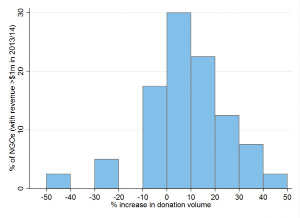 The chart shows considerable variation. The median NGO saw the volume of its donations increase by about 8 per cent. Total donations increased for most NGOs, in some instances substantially, but income fell for 10 (out of 41).
Overall, the 2014/15 financial year was a good one for Australia’s aid NGOs. People gave more, and more people gave. Not all NGOs benefited from this, but most did.
Terence Wood is a Research Fellow at the Development Policy Centre.
Note:
[1] The data used are for all NGOs that are members of the Australian Council for International Development, plus two large NGOs that aren’t members of ACFID: MSF and Compassion. This sample contains almost all of Australia’s large NGOs. An unknown number of smaller NGOs aren’t included (because they’re not ACFID members), but their small size means they will have little affect on overall numbers. The composition of NGOs used in the sample has stayed constant over time. There is no reason to believe that trends have been different for NGOs not included in the sample.

As a comparator, you can see a less happy trend in NZ on page 2 here: http://www.cid.org.nz/assets/Financial-summary-CID-Member-Survey-2016.pdf