Australia stumbles further down the donor generosity rankings
By Terence Wood
10 April 2018
[Editors’ note: This blog post was written based on preliminary global aid figures for 2017, which were released in April 2018. In December 2018, final aid data were released for 2017. When these revised data were released, they showed that Australian’s ODA/GNI ratio was slightly higher than Japan and New Zealand’s. We have amended the charts in this blog post to reflect this change; however, we have left the text as per the original post. Readers should note that when 2018 aid data were released the following year, Australia’s ODA/GNI ratio had fallen below that of New Zealand and Japan.]
Preliminary OECD data on donor generosity were released today. The data cover 2017, and should be troubling to any Australian politician thinking of cutting aid in the coming budget.
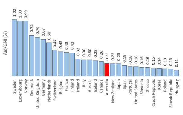
In the 2017 calendar year, Australian aid was just 0.23 per cent of Australia’s Gross National Income (GNI). Australia now lags badly behind the median aid donor (which gives 0.29 per cent). The chart below shows you how Australia compares to other donors. It is worth looking at the countries in Australia’s neighbourhood. For the first time since 2005, Australia gives less aid as a share of GNI than Japan. Beneath Australia are the notoriously tightfisted United States, alongside countries like Spain, Portugal and Greece that have been through brutal recessions, and a group of countries such as Slovenia and Poland, all with GDPs per capita less than half that of Australia’s.
Is this really Australia’s place in the world?
OECD DAC Aid/GNI – Final figures for 2017
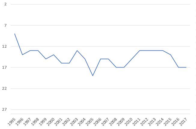
The next chart shows how Australia’s ranking as a donor has trended over time. A score of one means most generous. There are 29 donors in total. As you can see, Australia’s standing is not improving. It has fallen to 19th in 2017, its lowest ranking in the group (which was also ‘achieved’ one other time, in 2005). Needless to say, further aid cuts won’t help this.
Australia aid generosity rankings 1995-2017
[Charts, data and links to source files can be downloaded here.]
Aid is less than one per cent of federal spending in Australia (0.84% this financial year). It comes cheap. The cost of cuts on Australia’s international reputation are becoming higher, however, with each additional stumble down the donor generosity rankings.
(We’ve updated the Australian Aid Tracker to reflect the changes; you can see the full detail, including many other international charts, and download data yourself, here.)
[Editors’ note: This blog post was written based on preliminary global aid figures for 2017, which were released in April 2018. In December 2018, final aid data were released for 2017. When these revised data were released, they showed that Australian’s ODA/GNI ratio was slightly higher than Japan and New Zealand’s. We have amended the charts in this blog post to reflect this change; however, we have left the text as per the original post. Readers should note that when 2018 aid data were released the following year, Australia’s ODA/GNI ratio had fallen below that of New Zealand and Japan.]
About the author/s
Terence Wood
Terence Wood is a Fellow at the Development Policy Centre. His research focuses on political governance in Western Melanesia, and Australian and New Zealand aid.