Pallets for AusAid emergency aid supplies are prepared for delivery to cyclone ravaged Fiji (DFAT/Flickr/CC BY 2.0)
Australian aid in top ten for aid quality
By Sachini Muller and Terence Wood
9 October 2018
The recently-released 2018 Commitment to Development Index ranks some of the world’s richest countries by their dedication to policies that benefit people living in poorer nations. The index ranks countries across a range of areas. One of them is the quality of the aid a country gives. Each country’s aid quality score is based on the quality of a country’s bilateral aid as well as the quality of the multilateral organisations that it gives aid to. These aid quality scores come from the Quality of ODA dataset (QuODA) that the Center for Global Development also maintains.
QuODA ranks Australia at tenth out of 40 donors. This list includes multilateral aid organisations as well as country donors. If we only look at countries, Australia is ranked fourth out of 27 (New Zealand comes first). Australia’s overall score is 0.18, an average of its performance across 24 individual aid quality indicators. In this blog, we look at some of the indicators with a view to what, if anything, these data reveal about how well Australia gives aid. (For those interested in more details on QuODA or New Zealand’s ranking, see Terence Wood’s blog.)
The histogram below shows the distribution of Australia’s scores across the individual indicators. A score of zero for any individual indicator means average. As the chart shows, Australia’s scores across the indicators are clustered around the average, some negative, but 15 out of the 24 are positive. There are four indicators on which Australia scores particularly well – above one – and two on which it scores quite poorly – nearly minus two. Australia’s overall average is pulled up by the three indicators it does well on, but this is offset by the two indicators where it underperforms.
Australia’s scores on the QuODA by frequency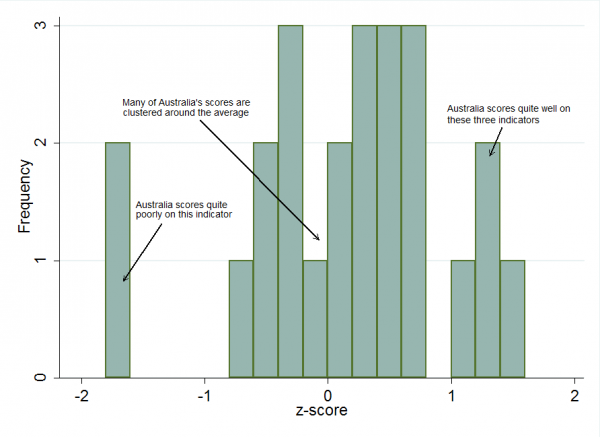
The table below shows Australia’s scores across the various indicators, from lowest to highest. We score quite negatively (-1.75) on making information on development funding publicly accessible. Why is this? We haven’t been able to obtain the underlying data that CGD used for the calculations for the scores (they come from a separate report), but the methodology explains at least some of the score. The indicator is based on reporting to the OECD Creditor Reporting System (CRS), OECD Forward Spending Survey, and International Aid Transparency Initiative (IATI). Although Australia’s score is helped by it producing IATI data (it’s efforts were assessed as ‘fair’ in this regard), Australia doesn’t report to the OECD’s Forward Spending Survey at all, which means that it automatically loses one third of its score for this indicator. Its reporting to CRS was assessed as needing improvement, likely because of a mixture of lack of timeliness in providing data and lack of accuracy in reported data.
Australia’s scores across the 24 indicators
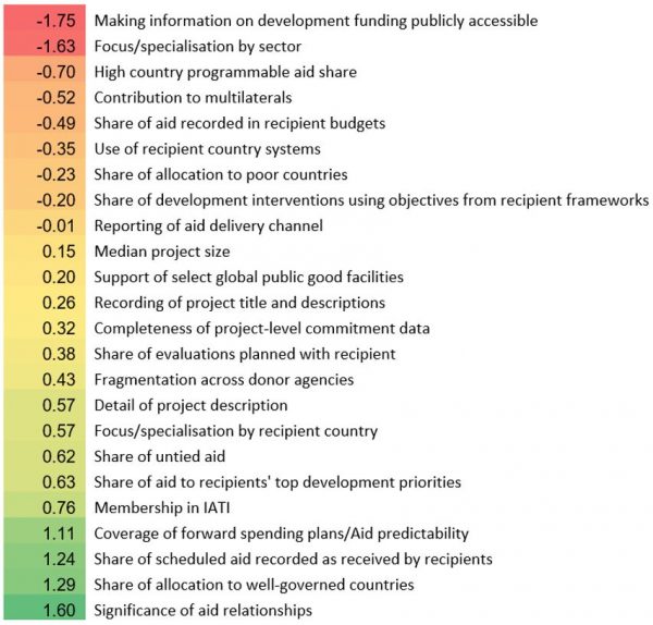
Australia also scored below average (-1.63) on specialisation by sector. It is difficult to understand why without the underlying data, but the methodology behind the calculations seems reasonable and may point to a real issue with Australian aid. This warrants further examination.
On a positive note, however, Australia does well on the share of aid allocated to well-governed countries and the significance of aid relationships. (See Terence’s explanation of what these indicators really measure here; the explanation for New Zealand also stands for Australia because both countries focus heavily on the Pacific). In short, the well-governed countries that we give aid to and have significant relationships with are mostly those in the Pacific. We do well on focus/specialisation by recipient country for the same reasons – we focus on the Pacific, and the Pacific region doesn’t have a large number of donors. The problem with Australia scoring so well because it focuses on the Pacific is that the indicators are designed to reward donors which have actively chosen to give aid to better governed countries and countries where there are fewer other donors. However, that’s not why Australia gives aid to the Pacific; Australia’s Pacific focus stems from proximity and historical relationships.
Australia also scores above average (1.11) on coverage of forward spending plans/aid predictability. This indicator measures the extent to which Australia makes information available on forward spending plans to recipient countries. The indicator is based on what partner countries tell the Global Partnership for Effective Development Cooperation. Assuming partner countries are reporting accurately, the obvious irony of this score is that Australia appears to do quite well at reporting future spending priorities to the countries it gives aid to. However, it won’t tell the OECD its forward spending plans.
There’s also a puzzle in that, although Australia scores well on the ‘forward spending plans’ indicator we score -0.49 on the score associated with how much of the aid we give to country governments actually ends up being reported on in the recipient country’s own national budget. In theory, a higher score on this measure indicates a donor that is working hard to communicate with recipients so that they know in advance what they’re going to get and can budget for it accordingly. It seems odd that Australia scores well on the ‘forward spending’ indicator but not on the ‘reported in budget’ indicator. We’re doing a good job of communicating forwards spending to partners, but they’re not then using the information in their own budgeting. Possibly this is because whether donor funding is budgeted for or not is also influenced by the ability and willingness of recipient countries to prepare high quality budget documents. The problem may, in other words, actually be with the recipient, not the donor. Without more information it is impossible to know whether Australia is actually the source of Australia’s poor score in this indicator.
What should we take away from this? Australia does very well on QuODA, getting into the top 25% of the countries listed. But it would be a mistake to conclude from this that all is well in Australian aid. Composite indices must be interpreted with care.
The best way to read QuODA is to ignore overall rankings and instead look at individual indicator scores. Here, QuODA highlights some genuine issues of concern (why isn’t Australia reporting its forward spending plans to the OECD? Should we be specialising more on particular sectors?) and some strengths, such as the share of scheduled aid recorded as received by recipients. And there are indicators where Australia’s scores reveal nothing more than problems with the indicator itself. Little can be inferred about the significance of aid relationships in Australian aid just because Australia gives a lot of aid to the Pacific. QuODA data can be very useful to a donor that wants to improve its aid giving, but it needs to be read carefully.
For those interested in taking a closer look at some of the other indicators, the methodology for QuODA is here and raw data scores here. See Terence Wood’s blog for a closer look at New Zealand’s ranking.
About the author/s
Sachini Muller
Sachini Muller was a Research Officer at the Development Policy Centre. She is currently completing a Master of Globalisation at ANU.
Terence Wood
Terence Wood is a Fellow at the Development Policy Centre. His research focuses on political governance in Western Melanesia, and Australian and New Zealand aid.