

[UPDATE: This blog was corrected on 27/2/2020 to correct an error in inflation calculations. The error affected Figures 3 and 4, and associated discussion. It led to NGO revenue growth being overstated. It did not change the performance of NGOs relative to each other. The figures and discussion have been corrected.]
Over the years, different staff and volunteers at the Development Policy Centre have gathered data on donations to Australian aid NGOs. Data have usually come from Australian Council for International Development (ACFID) annual reports or NGOs’ own annual reports. (We’re very grateful to ACFID and NGOs for being transparent enough to make this possible.)
The data collected hasn’t always ended up in the same place. So, slowly, the two of us have been collating and tidying datasets. In this blog we revisit two earlier posts, updating findings on NGO donations.
Donations as a whole
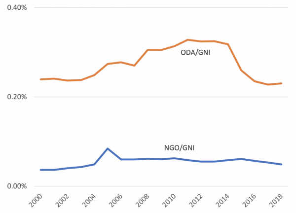
First, let’s start with the obvious: aid from the government is still much larger than Australians’ donations to NGOs. You can see this in Figure 1, which plots aid and donations as a share of gross national income (GNI). Donation data are for all ACFID members as well as the two largest non-ACFID members: Compassion and Médecins Sans Frontières (MSF). Other NGOs exist, but the NGOs we cover solicit the bulk of public donations. Including others wouldn’t change the picture much.
The y-axis in Figure 1 is fractions of a per cent: NGO donations have never been more than one-tenth of 1% (0.1%) of GNI. The largest contribution most Australians make to international aid comes via their taxes.
Figure 1: Donations to NGOs and ODA over GNI in Australia
Yet in the years since 2000, NGO donations have grown faster than government aid. You can see this in Figure 2, which plots change after inflation. The y-axis shows how many times larger donation volumes were in the year in question than in 2000. The point on the axis marked “2” means “twice as much”. Although they’ve fallen in recent years, NGO donations are now more than twice as large in absolute terms as they were at the turn of the millennium. Official development assistance (ODA) has grown, but not as much.
Figure 2: Inflation-adjusted change from 2000 – ODA and donations
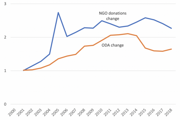
Australia’s economy has also grown, but NGO donations have outpaced this. NGO donations as a share of GNI are 32% larger than they were in 2000. In absolute terms that’s only a small increase (0.037% to 0.049%), but Australians have become fractionally more generous. On the other hand, Australian government aid fell slightly as a share of GNI (0.24% to 0.23%). (You can see calculations and sources in this dataset.)
Snakes and ladders
In 2015 Stephen Howes and Jonathan Pryke wrote about the changing fortunes of Australia’s 15 largest aid NGOs. We’ve repeated this. Howes and Pryke chose the 15 largest NGOs in the 2013 data they were working with. We used the same organisations, which are still the largest in our data. (Once again, the data are limited to ACFID members, Compassion and MSF. As a result, the exercise excludes a small group of large NGOs such as Amnesty International. It includes most large aid organisations though.)
Donation growth to this group as a whole has waxed and waned over the past 18 years. Figure 3 shows the 18 years broken up into three, six-year periods. For each period it shows total donation growth for the whole period as a percentage of starting donations. It shows this as a mean across NGOs, and it shows change for the median NGO. All changes are after inflation.
Figure 3: Inflation-adjusted change in donations from 2000 – largest 15 NGOs

Donation revenue grew rapidly from 2000 to 2006. Part of this was a result of the Indian Ocean earthquake and tsunami, but revenue kept growing at a healthy pace over the next six years. However, growth largely stalled in the six years to 2018.
That’s the story for the group as a whole. There’s been a lot of internal variation within the group though. Figure 4 shows this: the 15 largest NGOs are broken into three groups for each period: the fastest growers, middling growers, and the slowest performers. A few NGOs are missing from the first period as we didn’t have data for them. Again, all changes are after inflation.
The x-axis of each of the figures below displays total change in revenue between the start and end of the period divided by the revenue at the beginning of the period. The formula is: (donations at end of period – donations at start of period)/donations at start. The change is displayed as a percentage. Note that the scale of the x-axis changes between periods so as to produce legible individual figures.
In the first period everyone’s revenue grew rapidly, but growth among the fastest was astounding. MSF’s donation revenue increased fivefold over the period. In subsequent periods growth slowed down, but some NGOs consistently outperformed the pack: MSF obviously, but also the Hollows Foundation, which got off to a slower start then took off in the second and third periods. Compassion and Australians for UNHCR were also rapid growers in the two periods we have data for.
At the other end of the spectrum, World Vision, Save the Children and Tear Fund spent two periods in the slowest-growing group, while Oxfam and Care saw their fortunes fall considerably in the second period, and continued to struggle in the third.
Figure 4: Individual NGOs’ donation revenue change

To be absolutely clear, growth or decline in an NGO’s donation revenue is not an indicator of its virtues as an aid organisation. Wooing donors and delivering good aid are very different things. Having said that, some NGOs were a lot better at opening wallets, both in good times and bad. It would be fascinating to know the secrets of the best performers.
The individual NGO data that we’ve pulled together from colleagues’ work is here. We also have a final plea. Datasets are hard to build, and harder still to check. We struggled to find old annual plans in particular. If you think data for your organisation is wrong, please contact us.
[UPDATE: This blog was corrected on 27/2/2020 to correct an error in inflation calculations. The error affected Figures 3 and 4, and the associated discussion. It led to NGO revenue growth being overstated. It did not change the performance of NGOs relative to each other. The figures and discussion have now been corrected.]

Leave a Comment