
A new report, ‘Quality of Official Development Assistance Assessment‘ (QuODA), assesses the quality of aid given by donor countries and aid agencies. It offers an important complement to analyses of the quantity of aid, which dominate aid policy debate. Given that Australia’s aid budget is set to rise to an estimated $8-9 billion by 2015-16, the QuODA report is a welcome addition to the aid analysis toolbox.
The report assesses aid quality using 30 indicators, grouped in four categories that reflect the international consensus of what constitutes high-quality aid. The categories are: (1) maximising efficiency (eg. spending aid in countries where it has the most potential to help); (2) fostering institutions in recipient countries (eg. coordinating spending with local priorities and budgets); (3) reducing the burden on recipients (eg. cutting back on official visits and paperwork); and (4) transparency and learning (eg. sharing useful data on aid spending).
So how does Australia fare?
Australia is the top performer in the transparency and learning category. This is a good result. But Australia’s performance in other categories is not so strong. We rank 14th in the ‘reducing burden’ category, 19th in the ‘fostering institutions’ category and 21st in the ‘maximising efficiency’ category.
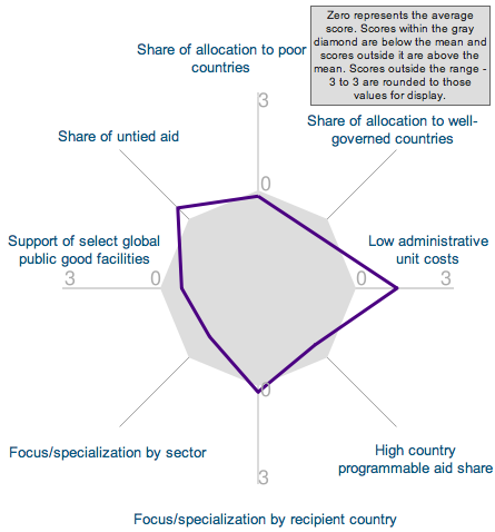
A more in-depth read through the (very long) report reveals some other interesting results for Australian aid. Australia is one of the top performers on the ‘low administrative cost’ indicator. This indicator compares donor administrative costs to the total amount of aid made available for programs and projects in partner countries.
Australia is one of the top performers on the ‘share of aid to recipients’ top development priorities’ indicator, demonstrating that Australian aid is guided by the priorities of recipient countries. Australia is also one of the top performers on the ‘fragmentation across donor agencies’ indicator. This is primarily because, in contrast to many other countries where a range of agencies have responsibility for disbursing and delivering aid, Australian aid is delivered through one agency – AusAID.
But it is not all good news. Australia is the worst performer on the ‘contribution to multilaterals’ indicator — just 10% of Australian aid goes through multilateral agencies, based on the 2008 data used in the report. This contradicts information on AusAID’s website, which puts the figure at 30%. Perhaps multilateral contributions have been ramped up over the past two years.
As always with these exercises, the data and methodology will be interrogated and critiqued. This should be encouraged. But the report is a comprehensive contribution to aid analysis and debate, and donors should learn from it. The next step for Australia should be to examine the results in detail, celebrate and build on success, and identify and address areas where there is room for improvement. It’ll be interesting to see when, how and if this happens.
For those wanting more, listen to report authors Nancy Birdsall (President of the Center for Global Development) and Homi Kharas (Deputy Director of the Global Economy and Development program at the Brookings Institution) on the CGD Wonkcast. Also try out QuODA’s online component to explore the data and see how donors compare.
Kate Higgins is a Research Fellow with the Overseas Development Institute, an international development and humanitarian policy think tank. She is based in Sydney.
A version of this article was first published here in the Lowy Interpreter.


The Quality of Offocial Development Aid Assessment report compares 31 aid agencies on four composite measures. AusAID performs poorly on three of these measures.
1) AusAID is ranked in the bottom third of agencies in terms of maximising efficiency (21 out of 31).
2) AusAID also ranks poorly in terms of the fostering institutions in the recipient countries (19 out of 31).
3) In terms of reducing the burden on the recipient countries, AusAid ranks in the middle.
4) However, on the measure of transparency and learning, AusAid ranks first.
This last ranking must be questioned, particularly in the light of the poor rankings on the other composite measures. Transparency and learning means little if it does not produce better results in terms of efficiency and improved aid delivery systems in recipient countries.
It is possible, using the linked website to compare AusAid with the UK’s aid agency (Department for International Development). This comparison shows that the UK aid agency performs much better on the three measures that matter.
This evidence indicates that a major reform of Australia’s systems for delivering aid are needed. (If AusAid disagrees with these indicators, because they omit key information or are out-of-date, then what performance indicators does AusAid propose?)
This form of scrutiny is essential to enable the public to judge whether AusAID is doing its job better and is able to manage effectively an expanded aid program.
Thanks for your interest in our QuODA assessment. We hope that it will be a useful tool.
Just as a point of clarification on the ‘contribution to multilaterals’ indicator: Our numbers are based on the DAC, which includes only core contributions, and does not include earmarked funding. This probably explains the difference between our results and what is on the AusAID website. Also, our figure is based on multilateral ODA as a fraction of total ODA gross disbursements; I’m assuming that the 30% figure from AusAID is also referring to a portion of gross ODA disbursements, in order for the numbers to be comparable.
-Rita Perakis
Center for Global Development
Kate,
You’re absolutely right that this report is a great addition to the aid analysis toolbox.
And good timing too. With the government expected to announce some type of review (anyone like to hazard a guess on its form: white paper; independent report; internal review?) of the aid program to assist with the huge budget boost, this is the kind of analysis that we need and it should feed into the discussions around how to scale-up the aid program effectively.
I think the ‘Maximizing Efficiency’ dimension – which is where Australia performs worst, is critical for this debate. There are several indicators within this dimension which are likely to dominate the ongoing conversation, or already do.
The ‘Focus/specialisation by recipient country’ indicator fits right into the discussion around whether to expand the aid program geographically further into Africa & Latin America, or remain focused on the Asia and the Pacific region.
The ‘Share of allocation to poor countries’ indicator is also increasingly contentious, as represented by the ‘poor people Vs poor country debate’ that has been discussed both on this blog and elsewhere.
The ‘Low administration costs’ indicator is often where aid budgets receive significant critique, and scrutiny in this area is only likely to increase as the aid budget almost doubles.
If Australia can look to how other nations are dealing with these issues and adapt its approach, or put up good reasons as to why they should buck the trend with some of these indicators (eg. Justifying a geographic expansion of the aid program), it will contribute significantly to improving the quality of its aid.
Kate,
Thanks for sharing this analysis of Nancy Birdsall and Homi Kharas’s exciting new report and I like your conclusions. Hopefully your article will encourage more people to read the report and there will be more debate, including through the Development Policy blog.
Here are four other reasons why I like the QuODA report.
1) Supports ‘evidence-based advocacy’. The neat charts make it easy for the public to see a donor’s relative strengths and weaknesses and to provide feedback. And it is another tool to help donors to plan and prioritise reforms to improve the quality of aid.
2) Comparing donor performance. In addition to providing some peer pressure for reform, it could also be an important tool for helping bilateral donors to allocate aid among multilateral agencies.
3) A rich source of data. Behind all of the charts is a wealth of data, and a useful feature of the report is that it can easily be accessed in excel format – providing a valuable resource for researchers.
4) Annual data. CDG and Brookings have said that they will publish the data annually, so this could also become a useful tool for tracking progress with aid effectiveness reforms.