Source: IMF; bars added by authors
The IMF graph above shows the path of the most recent commodity price boom, and with it the fortunes of many commodity exporters around the world. Commodity prices started to grow around 2004, fell in 2008 with the global financial crisis, recovered over the next few years and gradually declined from 2011 to 2014. Then in late 2014, with a combination of lower demand worldwide and greater supply of oil and gas, commodity prices fell sharply. For PNG, as suggested by the bars we have added to the graph, the boom started in 2004 and ended in 2014.
The commodity price boom brought enormous increases in revenue to PNG, as we showed in our first blog looking back at the resources boom and bust. The latter years of the resources boom also saw a large amount of borrowing. Now that the boom is over, it is a good time to look back on what was bought with all that additional government finance.
In this post we compare the pre-boom expenditure (2000 to 2003) to the boom years (2004 to 2014). We examine both average expenditure during the boom years, and then, because expenditure trends were dynamic over this period, the expenditure of the last year of the boom, 2014. All figures are adjusted for inflation, and expressed in 2015 prices.
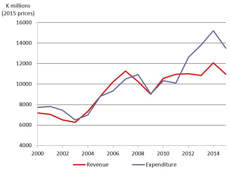
Figure 1 shows that expenditure approximately doubled between the start and the end of the boom. Revenue also increased, but not by as much. The difference was made up by borrowing, with large deficits towards the end of the boom.
Figure 1: Revenue and expenditure, 2000-2015
Source for all figures: Budget documents and BPNG for inflation. Data and calculations for all figures in this post can be found in this spreadsheet [.xlsx].
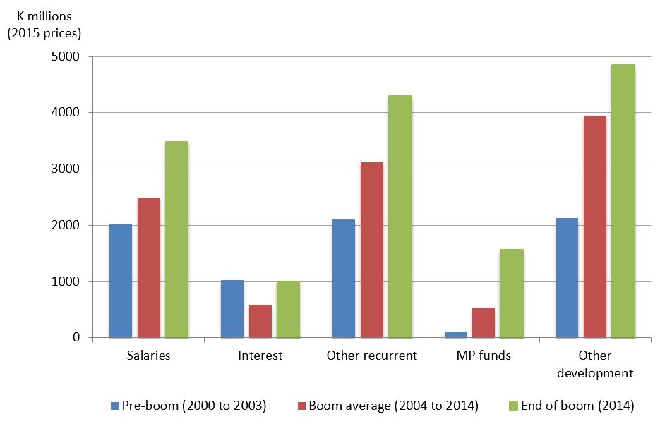
What was this increased revenue and borrowing spent on? Figure 2 breaks up total government expenditure into a few major categories. It shows salaries, interest, other recurrent spending, MP funds (DSIP etc.) and other development spending. For each expenditure item, there are three columns: the pre-boom average (2000-2003), the boom average (2004-2014) and the last year of the boom (2014).
Figure 2: Major categories of expenditure, pre-boom, boom average and end of boom
The biggest relative increase was in the funds provided to MPs, which went from virtually zero at the start to K1.6 billion by the end of the boom. The rest of PNG’s “development budget” (the Public Investment Plan) also increased rapidly going from K2.1 billion at the start of the boom to K4.9 billion at the end.
Overall, the share of the development budget in total spending increased from 30% at the start of the boom to 42% at the end of it. Broadly speaking, development spending corresponds to the capital budget. PNG is greatly in need of infrastructure investment. It is also easier to reduce capital spending when a boom comes to an end. On the other hand, it may be that capital projects are particularly prone to problems of corruption and waste.
A strong positive is that the interest bill fell over the boom period, from K1 billion just before the boom to K0.6 billion on average during it.
There was significant growth in the non-salary, non-interest recurrent budget (goods and services as well as transfers) which increased from K2.1 billion before the boom to K3 billion on average during it. This category finances useful things like road maintenance and drugs purchases.
Finally, the salary bill was contained for much of the resources boom. It increased on average by only 24%, less than all the other categories except for the interest bill.
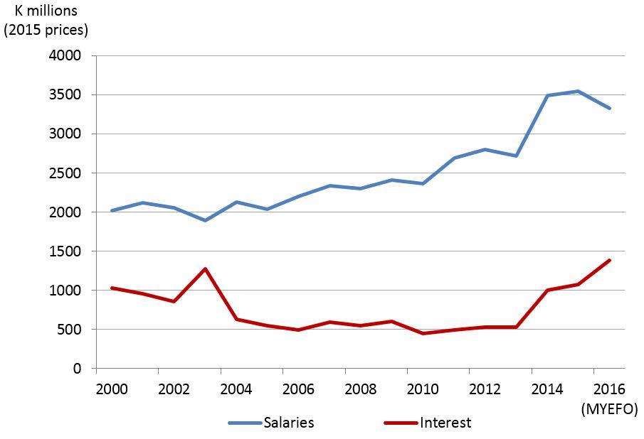
While there are several positives to take away from these expenditure patterns, there are also some negatives, particularly towards the end of the boom. As Figure 3 shows, the last few years of the boom saw rapid increases in the salary and the interest bills, even after inflation.
Figure 3: Salary and interest payments (adjusted for inflation), 2000-2016
Salaries are sticky. Figure 3 also shows actuals for 2015 and the budget estimate for 2016. Revenue has fallen sharply since 2014 (as we showed in our last post, back to 2006 levels in real terms), but it is difficult to compress the salary bill. The government is hoping to reduce the salary bill in real teams this year. But even if it does, the salary bill will still be about K1.3 billion higher than it was before the boom. And the interest bill will only keep rising on account of the high recent borrowing. As Figure 3 shows, interest payments have already reached K1.4 billion this year.
The story seems to be that at the start of the boom, tight control was exercised over borrowing and the salary bill. This delivered reduced interest payments and only a modest increase in the salary bill, allowing significant increases in the development budget and in goods and services. But towards the end of the boom, that control was relaxed leading to rapid increases in both the salary bill and in interest payments.
Combine a higher salary and interest bill with much less revenue and limited borrowing capacity, as well as new “boom period” government spending commitments (such as increased MP funding), and you can see why there is now such a squeeze in so many expenditure areas. That is the difficult legacy of the resources boom.
Stephen Howes is the Director of the Development Policy Centre. Rohan Fox is a Research Officer at the Centre.
Note: This year PNG has switched to GSF-2014 government accounting standards, but figures using these new standards are only available back to 2012. So all the data in this post is based on GFS-1986 accounting standards. The only exception is for 2015 and 2016 for salaries and interest in Figure 3, where GFS-2014 figures are used. Comparison of earlier years shows no difference in these two categories of expenditure between the different accounting standards. Actuals are used for all years except 2016. For comparability, salaries are provincial and national salaries only. Download the data and calculations for the figures in this blog post here [.xlsx].


You touch upon a core problem, but only lightly – the fact that so much of the expenditure classified as capital is not in fact used for the creation of assets (roads, bridges, schools, medical facilities) though it is recorded as having been spent that way. Instead it disappears. In some provinces almost entirely. As numerous PNG audit reports attest.
The article pretty much explained the current situation and I believe the expenditure has gone passed the revenue generated in PNG. ‘MP fund’ is one of the area that experienced relative increase especially during the boom period and I guess is continuing today. What does ‘MP fund’ mean? I tend to understand that MP fund refer the funds that is discretional to the MP, hence the relative increase has seen more discretional funds to the MPs.
Yes, you are right Chris, the MP funds that we refer to are those funds which are discretionary to MP’s
Hi Rohan and Chris
The MP funds is only a term used to refer to a number of funds given to the electorate in which the MP is the CEO/ chairman of these funds, eg DSIP. Out of the DSIP there is a certain % as discretionary fund for the MP to use not for personal gain but still for public good. However in practice the MP ended up deciding for all the funds; how, where, when & whom it should be used. That’s why we can simply say “MP funds”.