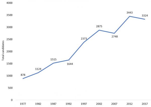
Fewer candidates will stand in this year’s general election in Papua New Guinea than stood in 2012. You can see this in the chart below. It is only the second time candidate numbers have fallen since independence.
Total candidate numbers, PNG general elections 1977-2017
(Note that my numbers are lower than some other published figures. I’m not sure who is correct. However, the differences are too small to matter.)
I’ve heard two explanations of why numbers have fallen. The first is that candidates were put off by talk of raised candidate registration fees. In the end, fees didn’t go up, but its possible that the belief they were going to stopped potential candidates from laying the necessary groundwork for their campaigns, and so people who might have stood didn’t. The second explanation is that the constituency funding in the hands of PNG’s MPs is now so high that challengers viewed their chances of beating incumbents as too low to be worth the bother. Something along these lines appears to have happened in Solomon Islands in 2014: constituency development funding rocketed up, candidate numbers were lower than expected, and most sitting MPs were re-elected.
If the first of these explanations for the fall in candidate numbers was correct it would be interesting — suggestive of the actual impact of a fee rise should it ever occur. If the second of these explanations was correct, it would be worrying. A situation where sitting MPs were so cashed-up with government money that potential rivals did not bother to challenge them hardly meets democratic ideals.
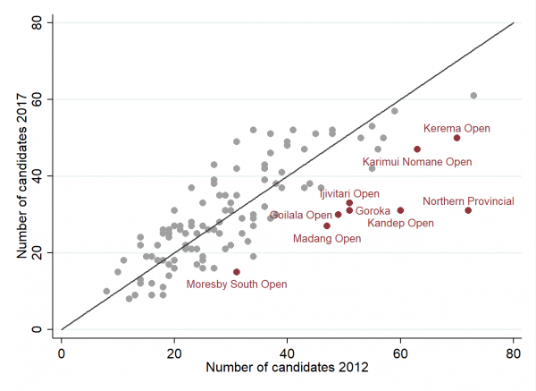
As it happens, neither explanation appears correct. I say so because both of the posited causes ought to have had a similar effect across all, or almost all, electorates. Yet this is not the case. The chart below is a scatter plot. Each dot on it is an electorate. Its position along the y-axis reflects the number of candidates standing in it in 2017. Its position along the x-axis reflects the number of candidates who stood in it in 2012. The diagonal line plots the one-to-one relationship. Dots below the line are electorates where candidate numbers fell between 2012 and 2017. Points above the line are electorates where candidate numbers went up. If candidate numbers had decreased around most of the country, almost all of the dots would be below the line, but they’re not. Many are above it (electorates where candidate numbers went up). What’s happened is that most of the fall in candidate numbers has been driven by a small number of electorates where candidate numbers fell a lot. These are the named electorates in the chart.
Candidate numbers by electorate, 2012 and 2017
As you can see some of the electorates where candidate numbers fell the most had particularly high numbers of candidates in 2012. I’m not sure why numbers fell so much in these electorates (possibly it’s just regression to the mean). Everything else being equal though, a fall in candidate numbers in the busiest electorates is a good thing — it ought to make elections easier logistically than they would have otherwise been.
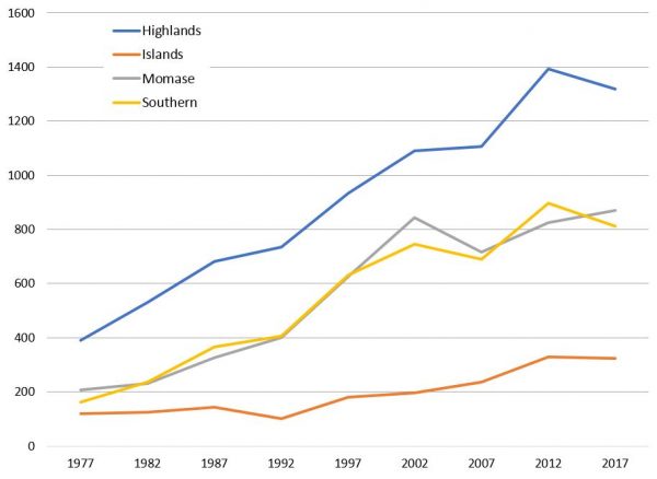
Interestingly, candidate numbers have fallen more in some parts of the country than others. In particular, as the next chart shows, candidates numbers have fallen in the Highlands and Southern Regions, but stayed the same in Islands, and actually increased in Momase.
Candidate numbers by region
Once again, I don’t know why this has occurred, but it will be intriguing to see if it is associated with other aspects of electoral competition.
If you want access to the data in this blog you can download it here. Remember, if you’re interested in PNG elections you’ll love our PNG Election Results Database.
Terence Wood is a Research Fellow at the Development Policy Centre.

