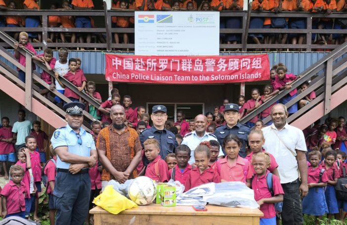

The Guardian is far from the worst offender in reporting on Chinese aid (that award goes to the Sunshine Coast Daily, which helpfully told readers last year that “China almost has Australia surrounded”). The Guardian is, however, guilty of repeatedly making misleading statements about how much aid China gives to the Pacific. Others are also doing this, but the Guardian’s reporting combines all the main errors in a few short sentences. As a result, it’s a great teaching tool.
In 2018, the Guardian published an article claiming:
In 2014, China was the fourth-largest donor to the region behind Australia, the US and New Zealand. However steady increases from China, combined with aid cuts by the US, has seen China rise to become the second-biggest donor by money spent and the largest donor by aid money committed in 2017.
This year, one of their journalists finessed the factoids further:
Australia has traditionally been the most significant donor to the Pacific, but in 2017 China committed to spending more than four times as much as Australia.
The data behind these claims come from the Lowy Institute’s Pacific Aid Map. The map stems from an astounding data-gathering effort by Lowy staff, in which they attempted to obtain data on all government and multilateral aid projects in the Pacific. Unlike the OECD’s datasets, the Aid Map covers non-OECD donors, including China. It’s an incredible resource. But it’s easy to misuse.
Let me walk you through the Guardian’s mistakes.
Time out
The most simple is that, although the Pacific Aid Map will display data for years from 2011 to 2018, Lowy’s data are only complete between 2012 and 2016. Data are available for some donors in years such as 2017, but not all. This isn’t a secret – it’s explained on the entry page to the map’s website.
Incomplete data make 2017 comparisons pointless. It’s not possible to claim, as the Guardian did, that in 2017 China had risen, “to become the second-biggest donor by money spent”. New Zealand was the second largest donor in 2016. The Aid Map has no data for New Zealand after March 2017. This chart shows what happens when we compare Aid Map data for China and New Zealand in 2016 and 2017. New Zealand spent more than China in 2016, then it looks like New Zealand’s aid spend collapses. But it didn’t – the Aid Map is simply missing data on New Zealand for most of the year. From New Zealand’s reporting to the OECD we know New Zealand gave about US$225 million to the Pacific in 2017. China wasn’t the second largest donor in 2017: New Zealand was.
Aid Map data on spending from China and New Zealand

Promises, promises
What about the claim that China was the, “largest donor by aid money committed in 2017”? Or that, “in 2017 China committed to spending more than four times as much as Australia”? That sounds startling – unless you know that aid donors make promises, so-called ‘commitments’, but they don’t always make good on them. A careful look at Aid Map data suggests China has been better at promising than spending in the Pacific. You can see this in the chart below.
Talking about large aid commitments may be a good way of getting readers’ attention, but if you’re interested in aid’s impacts, it is actual spending that matters. Spending, not words, helps people. Spending, not words, pushes governments into debt.
China, commitments and actual spend 2012-2016

2017, the year China finally took over?
Commitment data come from different sources too. This is why – even if you still felt compelled to report on commitments – it would be wrong to say that in 2017 China committed, “to spending more than four times as much as Australia”.
Because China does not provide accurate official reports on its aid flows to the Pacific, Lowy had to take what they could from media and government reporting in Pacific countries. This was the best possible approach, but came with a big issue: Chinese aid promises recorded by Lowy in one year are sometimes destined to be spent across many (this may also explain some of the other differences between Chinese aid commitments and actual spending).
If you download the full (>100 MB!) Aid Map dataset, you’ll find China’s $4 billion commitment in 2017 comes mostly from a promise to spend $3.5 billion on 11 roads in different parts of Papua New Guinea (you can see this on row 66,959 of the dataset). I know China has amazingly fast trains, and skyscrapers that appear overnight, but the Chinese won’t build those roads in a year. They’ll be lucky to finish them in 10 years (one of the roads is a highway connecting Gulf Province to the Southern Highlands!). This is a multiyear aid spend, reported on in one year.
Australia, on the other hand, reports commitments following the OECD protocol of stating what they have promised to spend in each individual year. When you compare China’s 2017 commitments with Australia’s, you are comparing China’s aggregate promises for many coming years with a single year estimate for Australia. The comparison is meaningless.
I’m not pointing this out to chastise the Guardian, which covers development issues better than most papers. And I’m not trying to hassle journalists. It’s not fair to expect them to be data experts alongside everything else. But I am hoping they will pay heed to this blog. If Australia is to navigate a changing Pacific, its domestic conversations need to be driven by facts, not misunderstood data.