

The years since 2015 have not been kind ones for Australia’s development NGOs. As the top line on the chart below shows, between 2015 and 2024, with inflation taken into account, donations from the public fell by 20%.
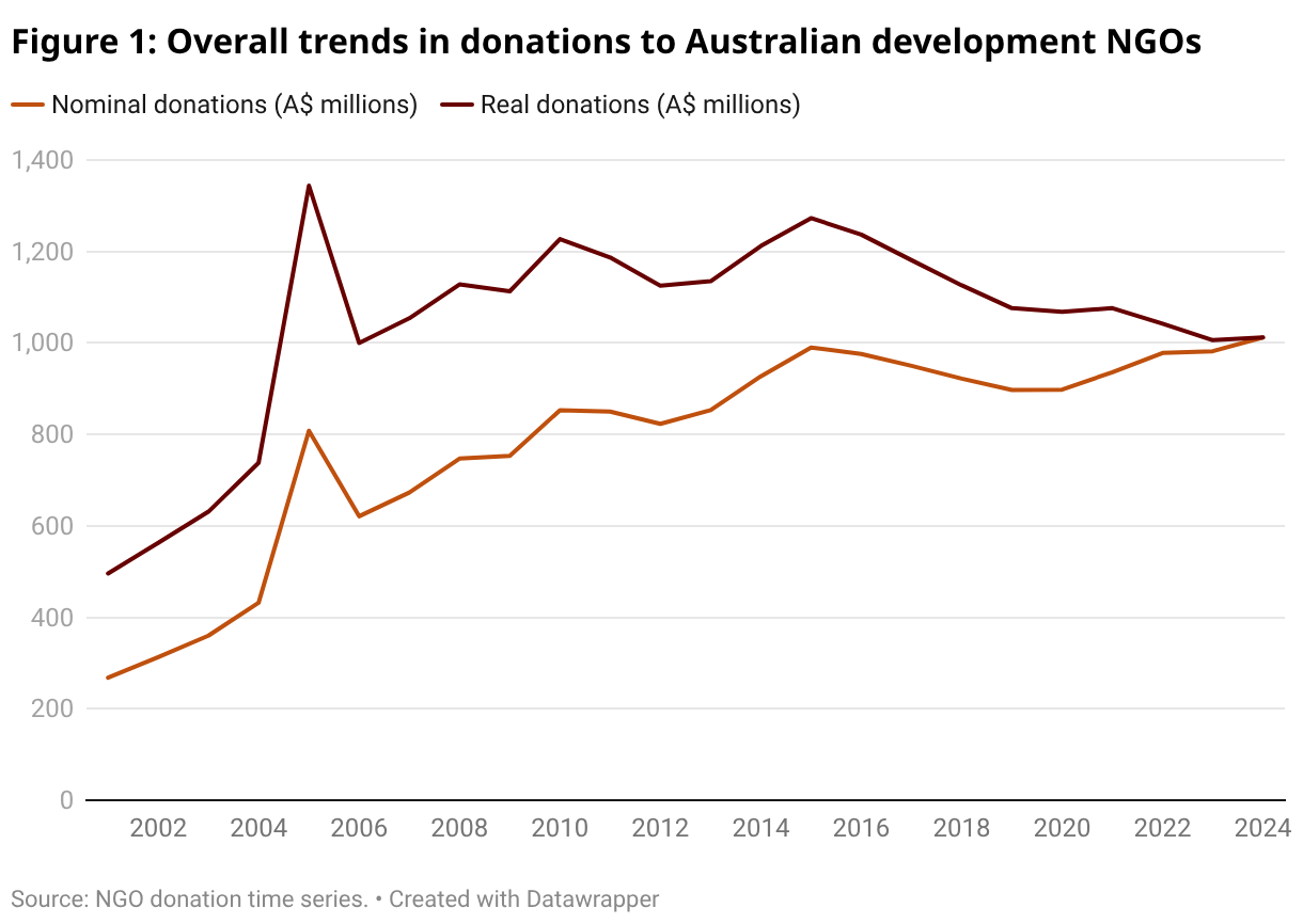
Part of the NGOs’ donation woes have come from economic circumstances in Australia. As I’ve shown in the past, there is a reasonably clear correlation between economic growth and changes in the volume of donations to Australian development NGOs. The relationship is far from perfect but, broadly speaking, in years when economic growth has been low, NGO donations have grown very little or have fallen. Other factors contribute to donation volumes. The 2004 Indian Ocean tsunami, for example, explains the massive spike in donations in 2005. However, disaster trends don’t seem to be behind the fall from 2015 to 2020.
Slow economic growth explains part of the fall in donations from 2015 to 2020 but, since 2020, a different problem has plagued the sector: inflation. The bottom line in Figure 1 shows the volume of donations before inflation has been taken into account. As the line shows, if we ignore inflation, donations have been on the rise. The problem for NGOs is that donations haven’t grown fast enough to keep up with inflation.
To illustrate what has happened, consider the following example: in 2021, let’s suppose, hypothetically, that I gave $100 to the hypothetical NGO “Spreadsheets Without Borders”. In 2022, generous soul that I am, I decided to give a bit more, so I gave $105. On paper, at least as far as I was concerned, I’d dug even deeper into my wallet. But, because inflation was nearly 8% in that year, my contribution actually fell in real terms.
I’m guessing the hypothetical me is pretty typical. I doubt that many donors go to the Australian Bureau of Statistics’ website, spend half an hour trying to navigate it and download Consumer Price Index data when deciding how much to give. The problem is made worse by those donors who sign up for automated regular donations. This is the right way to give – regular donations mean regular revenue for NGOs, which makes planning and working much easier. Unfortunately though, automated donations of this sort aren’t normally increased in line with inflation, so their real values fall over time, especially when inflation is high.
Inflation has undermined donations to NGOs in recent years. However, 2024 – the most recent year we have data for – brings slightly better news. In 2024, donations managed to outpace inflation. The rise wasn’t huge and one year isn’t a trend. But it’s certainly better than a fall. And perhaps it’s a sign of better times to come.
That’s the story for the sector as a whole. However, not all NGOs are created equal and, by virtue of their size, several large NGOs, particularly World Vision Australia, have a huge influence on overall giving. Initially, I thought that the overall fall in donations from 2015 to 2024 might have simply been driven by tough times at the top.
Yet, as I dug into the data more, I discovered that this wasn’t the case – falling donations weren’t just a phenomenon affecting a few large NGOs. It’s true that, of the 10 largest NGOs that we follow, eight saw their inflation-adjusted donation revenue fall from 2015 to 2024. However, in the chart below I’ve broken NGOs into three categories based on donations received in 2015 – the largest third, the medium third and the smallest third. The chart shows that donations fell for a substantial majority of organisations in the largest two thirds of NGOs. Only amongst the smallest third of NGOs that we have data for did donation revenue grow for the majority of organisations. (It’s worth emphasising “that we have data for”. We have a full time series of data for the largest NGOs; our data for the smallest NGOs are more patchy.)
Figure 2: Changing donations amongst different sized NGOs

Source: NGO donation time series.
What explains the varying fortunes of different-sized NGOs? My guess is that donations to larger NGOs are influenced a lot by the state of the economy. These are the organisations with fundraising teams and many donors, most of whom the NGOs have little personal connection with.
However, things are different for smaller NGOs. In the case of the bottom third of NGOs, the rise in revenue was mostly driven by the very smallest organisations (NGOs with inflation-adjusted donation revenue of less than $150,000 in 2015). In 2015, the median NGO among these tiny NGOs had just 140 donors. When revenue comes from only a handful of givers, my guess is that it’s much easier to maintain ties, and donations, over time.
The world of NGO donations is a complicated one – not all NGOs raise cash in the same way, and this has an impact on how their revenue changes over time. But – for the sector as a whole – 2024 brings some good news: even with inflation accounted for, donations have begun to rise.
Note: we are very grateful to the Australian Council for International Development (ACFID) for their willingness to share data with us. We add additional NGOs and undertake further calculations once we get the data. For this reason, ACFID are not responsible for the numbers included in this post. Please note that every year we are working on improving our dataset. For this reason, numbers in this blog post are not identical to numbers in earlier years’ posts.
Updated data is available on the Australian Aid Tracker’s Trends page.


Allow me to offer some practical observations, having supported various local and overseas charities for the past 40 years. Now retired, I have to choose where to offer my donations. This is especially as, as many continue to request donations only some weeks after I have already made one. Seemingly on some sort of automated “request” system, I had to decline – more frequently.
One alternative has been to narrow my donation priorities – now mainly for refugees. Especially those Afghans fortunate enough to make it to Australia. My firm priority – always – is MSF: so often the only medical and health facilities in those locations producing refugees.
This article provides an insightful overview of the trends in donations to Australian development NGOs, highlighting both the decline in recent years and signs of recovery.
Sustained public engagement and policy advocacy play an important role in supporting long-term development outcomes. Organisations such as The Borgen Project focus on raising awareness around global poverty and the importance of effective development funding, which connects closely with the issues discussed in this article.
I calculated this according to constant dollars and %GDP over 50 years (see Kilby 2015 History of ACFID ANU Press p. 3 open access) and as a % of GDP has fallen since the 1970s but in constant dollars has tended to rise even accounting for the tsunami blip. As with all things the base year is important.
Not that important. The same is also true if you choose 2001 as your base year as per the chart in this post.
However, the base year is important if you’re the CEO, or an employee, of an NGO who’s revenue has been falling steadily since 2016. That means job losses and project cuts. Not much consolation under those circumstances to know that things are better now than they were 50, or 25, years ago.
I’m a glass half full type of person: the 50 year figures show remarkable stability in terms of adjusted dollar value, but there have been fairly regular fluctuations due to economic circumstances such as recessions etc (the period you refer to has mostly been in a per capita recession, not helped by COVID uncertainty). I remember around 15 years ago an INGO I know had to cut 25% of staff. That’s the sort of thing that management is virtually always facing. Tsunami windfalls can’t be banked by definition, but lead to increased staffing which ultimately have to be let go. That is a sort of NGO paradox.
Good point, Patrick. The question is what makes for a good choice of base year? As Terence points out, early data is patchy.
Sheldon see my book History of ACFID fig 1, p.3. This takes the numbers back 50 years. I hope you’re not suggesting ACFID Annual Reports are ‘patchy’. A few retired staff may disagree.
Thanks for the direction, Patrick. Just downloaded a copy of your book and found the graph. Very useful indeed. You used data from the ACFID annual reports, which I understand to be a consolidation of data submitted to ACFID annual. The patchiness I refer to relates to the original reports of member organisations. I have sought to access these for early years and understandably these are often absent from archive or other data repositories. I am also interested in the picture including Non-ACFID member, which obviously would be missing from ACFID’s annual reports.