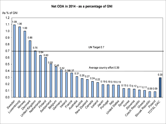
On the basis of preliminary estimates, in April 2015 the OECD reported a slight fall in Official Development Assistance (ODA) from 2013 to 2014. However, when the final numbers were released at the end of the year, it emerged that ODA from the 28 member countries of the OECD Development Assistance Committee (DAC) had actually increased by $1.6 billion or 1.2% in real terms in 2014, setting a new record of $136.5 billion at 2013 prices.[1] This might come as a surprise to anybody who believes that most DAC donors have been busily slashing their aid budgets. It might come as less of a surprise to people who believe that DAC donors have been sneaking domestic costs into their aid budgets. What is actually going on here? Who is cutting and who is not, and are donors really adopting performance enhancing techniques to inflate their spending figures?
The short answer is that aid cuts are mainly being imposed by some smaller donors and that, while the counting of more onshore refugee costs did assist the growth in OECD aid from 2013 to 2014, aid would have been maintained at almost exactly the record level achieved in 2013 even without this. Debt relief, which in some years has distorted aid levels, was at a very low level in 2014, but a fall in repayments on ODA loans contributed more than a little to the overall ODA increase.
Overall, the result was a solid one, but it does bear analysing. This post, the first of three, pulls apart the numbers on OECD aid but also, drawing on some less-used OECD statistics, looks at the striking growth in aid from countries that are neither DAC members nor members of the BRICS bloc (Brazil, Russia, India, China and South Africa).[2] Given this growth, which has brought about a 20% real increase in the quantity of aid available to developing countries over the last two years, it might be argued that the numbers on DAC aid are not as relevant as they used to be. However, non-DAC aid is volatile and directed mainly to the Middle East and Egypt.
Total outflows from DAC countries
The headline global ODA outcome figure announced each April by the OECD represents the amount of money that exits the treasuries of DAC countries and is destined either for developing countries, more or less directly (bilateral aid), or for multilateral organisations (multilateral aid). It is a measure of outflows from this set of donors and therefore of their aid effort. The 1.2% increase after inflation in DAC aid outflows in 2014 reflected 0.8% growth on the bilateral side of the ledger and 2.2% on the multilateral side. Figure 1[3] gives a three-decade perspective on ODA outflows from DAC countries, with amounts expressed in constant 2013 prices.
Figure 1: DAC ODA
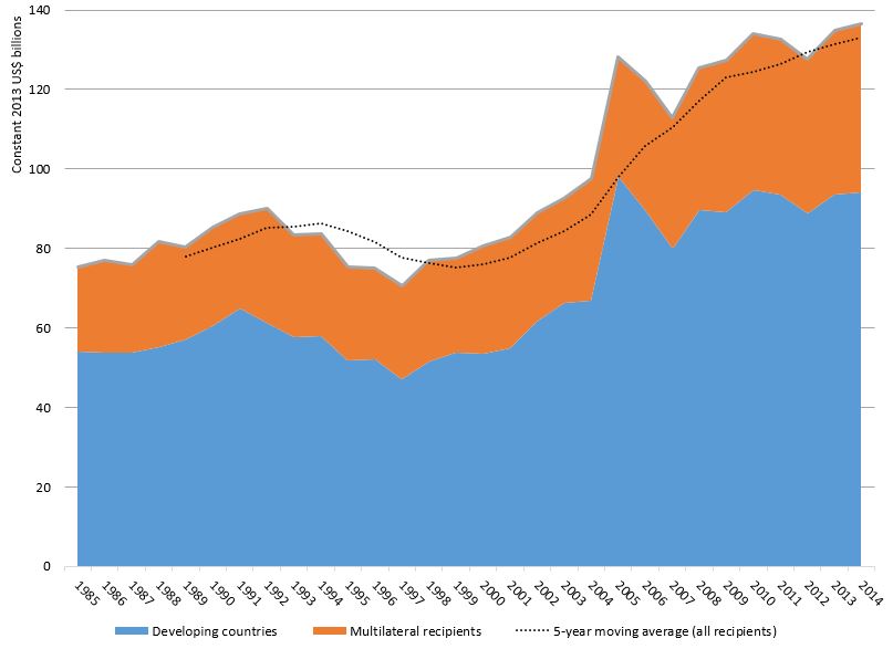
Only about half of the DAC’s members are significant donors, so it’s convenient to look at the 14 main individual donors and lump the rest together as a composite donor, ‘Other’. Of these 15 donors, nine, accounting for 67% of ODA in 2014, increased their aid by a total of $5.2 billion in 2014. The largest increases were those by Germany at $2 billion, the United States at $1.3 billion, Sweden at $650 million and Italy at $560 million. The other six cut their aid by a total of $3.6 billion. The biggest cut was made by Japan ($1.7 billion), followed by France ($790 million), Canada ($480 million) and Other ($320 million).[4] In short, more countries increased than decreased and several of the largest donors increased, so the increases more than offset the decreases.
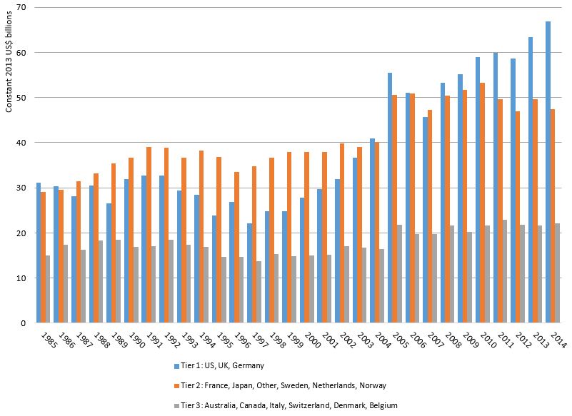
There are now broadly three tiers of DAC donors. In a top tier above $15 billion per annum are, in order of volume, the United States, the United Kingdom and Germany, all of whom increased aid in 2014. In a second tier between $5 billion and $10 billion are France, Japan, Other, Sweden, the Netherlands and Norway. The first three donors in this group, and the last, all reduced their aid in 2014. In a third tier below $5 billion we have Australia, Canada, Italy, Switzerland, Denmark and Belgium. The first two donors in this group reduced their aid in 2014; the others increased theirs.
The cuts in the second tier are of the most significance. France’s aid has fallen in each of the four years 2011-14 and could well be heading into a trough of the kind last seen around the turn of the century when its aid stood at around 50% of the peak levels achieved in 1994 and 2010. Combined aid from Other (DAC donors outside the top 14) appears to have peaked in 2008 at $14 billion, and in the three years 2012-14 was under $10 billion. Less significance can be attributed to the 2014 fall in Japanese aid, given that flows on its ODA loan portfolio are always volatile—Japanese aid increased by $3 billion in 2013, so the $1.7 billion fall in 2014 still leaves it around $1 billion above the average level achieved over the years 2007-12.
It is noteworthy that the three countries in the top tier in 2014 provided about one-third of DAC aid in the late 1990s, but now provide just under half, or $67 billion. The shifting balance between the first and second tiers over time is illustrated in Figure 2. The performance of individual donors within each tier can be viewed here.
Figure 2: ODA from three DAC donor groupings
Total inflows to developing countries
It is not always well understood that the term ODA is defined in such a way that, strictly speaking, it can only be applied to outflows from donor governments (though not necessarily DAC member governments). In practice, the term is often used more loosely to also cover inflows to recipient governments from any official source, whether bilateral or multilateral, provided the flows meet criteria [pdf] relating to motivation and concessionality. This outflow/inflow ambiguity is convenient, but can be confusing. From a developing country perspective, what really matters is not how much money exits the treasuries of DAC countries, but rather how much money is available from all sources—DAC bilateral, non-DAC bilateral and multilateral.
Until about a decade ago, this was generally a distinction without a difference. DAC outflows to multilateral organisations were about the same as outflows from those organisations to developing countries, and non-DAC aid was in most years negligible. Since 2005, however, there has been a growing divergence between DAC ODA and the total aid receipts of developing countries, as illustrated in Figure 3.
Figure 3: DAC ODA outflows vs total aid receipts of developing countries
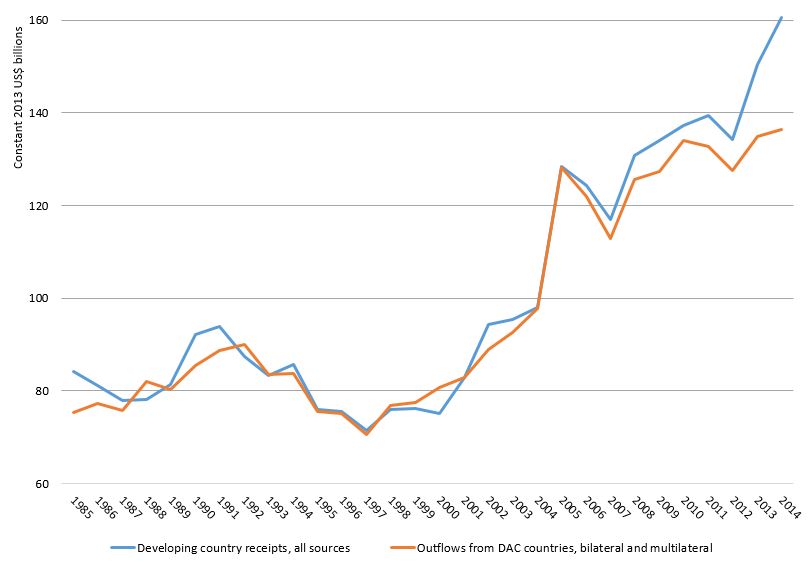
Up to 2010, DAC ODA and total developing-country aid receipts at least moved in the same directions. But in 2011, a year in which DAC aid fell and was widely assumed to have passed its peak, the amount of non-DAC bilateral aid reported to the OECD more than compensated for the reduction in DAC aid. The total level of ODA received by developing countries actually increased by several billions of dollars. Both quantities fell in 2012, presumably reflecting the lagged impact of the global financial crisis, but both recovered in 2013 and grew again in 2014, with the growth in non-DAC bilateral aid being far more dramatic than that in DAC aid. If one looks only at DAC aid outflows, aid has fallen in three of the last 10 years and has increased by a net $10 billion over that period. If one looks at total aid received by developing countries, aid has fallen only twice in the last 10 years and has increased by some $32 billion to a high of $161 billion.
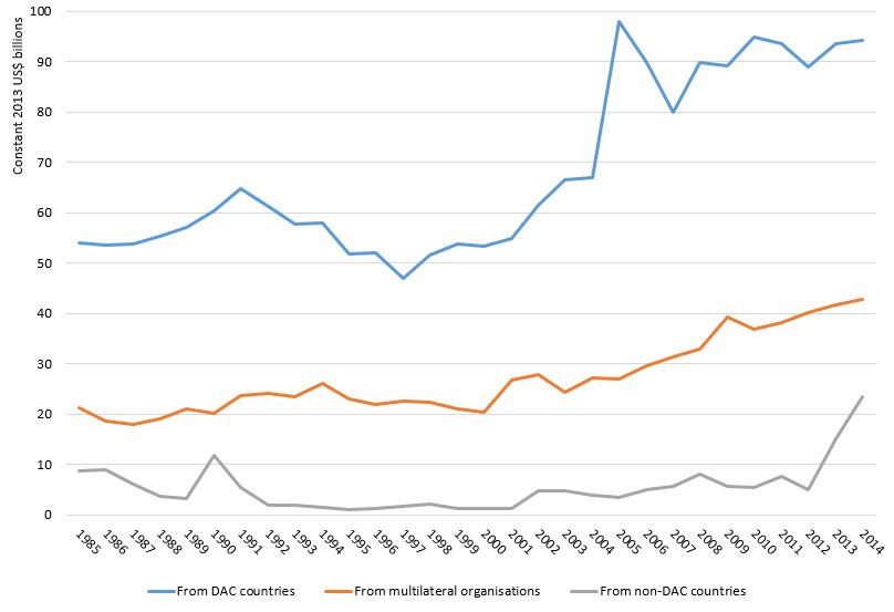
Figure 4 shows total aid to developing countries broken down by major source (DAC bilateral, non-DAC bilateral and multilateral). DAC bilateral aid has been relatively flat in the $90-$100 billion range for the last seven years. Aid from multilateral sources, which is made possible mainly by DAC donors’ contributions to multilateral organisations but also increasingly by private donations and internally generated resources, has quite smoothly increased by some 25% over the last decade, including 2.7% in 2014. Aid from non-DAC bilateral sources took two very big jumps in 2012 and 2013. After increasing by 200% in 2013, it increased by a further 56% in 2014 to reach a high of $23.4 billion. The same numbers for DAC countries were 1% and 5%, respectively. As a result of this growth in non-DAC aid, total concessional resources available to developing countries increased by 7% in 2014 and 20% over the past two years. Most of this money comes from Saudi Arabia, the United Arab Emirates and Turkey, and most of it (around $20 billion) goes to the Middle East and Egypt.
Figure 4: Aid receipts of developing countries by major source
It’s important to stress that the figures on non-DAC aid discussed above are based only on data that is actively reported to the OECD by the relevant donor countries. Among the BRICS, only Russia reports to the OECD on its aid. However, while the OECD does not receive aid data from all possible sources, it does collate publicly available information on aid from many non-reporting countries, which it makes available in this spreadsheet, updated annually. Based on these admittedly rubbery estimates, total aid from the BRICS other than Russia was probably around $5 billion in 2014 and therefore total aid from all non-DAC sources was probably around $30 billion. Figure 5, based on an accumulation of such OECD estimates, shows the growth in all non-DAC countries’ aid outflows in current–price terms since 2007.
Figure 5: Aid from non-DAC countries
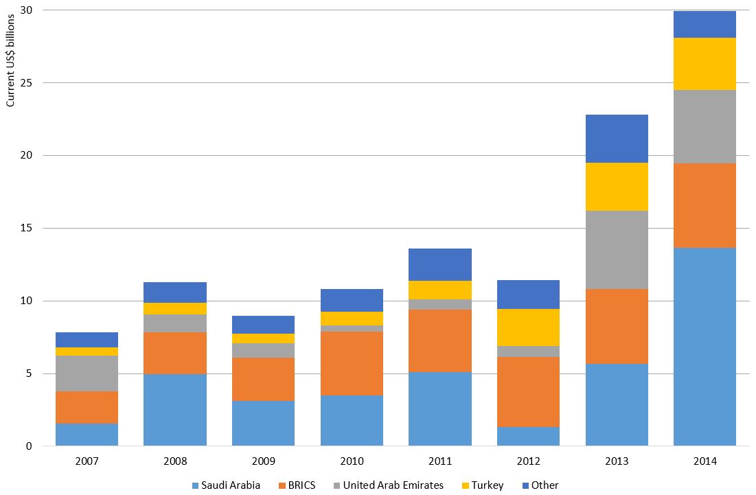
If one were to ignore DAC membership and construct a league table of the main donor countries in 2014, Saudi Arabia would occupy fourth position, after the three top-tier DAC donors. The United Arab Emirates would be in 10th position, after Norway but above Australia and Canada. Turkey—despite being the seventh-largest recipient of ODA in 2014—would occupy 14th position, ahead of Switzerland and Denmark.[5] As for China, if the OECD estimate of its ODA-like assistance in 2014 is about right, it would sit a fraction of a rung below Turkey.
The second post in this series will examine the distribution of aid to groupings of developing countries and multilateral organisations in 2014, and discuss trends over time.
Robin Davies is the Associate Director of the Development Policy Centre.
This three-part blog series (part two here and part three here) has been compiled into a policy brief titled “Aid’s new contours: an exploration of global aid flows in 2014“.
[1] The previous estimate had been $134.4 billion.
[2] It is unwise to make too much of year-to-year variations in aid levels so, wherever possible, information on 2014 flows has been placed in a long-term (three-decade) context. In some cases, though, detailed data are only available from 2002. In addition, spending outcomes in 2014 are sometimes compared not only to 2013 outcomes but also to average outcomes over the previous five years. All amounts are in US dollars unless otherwise specified.
[3] Unless stated otherwise, the data source for all figures in this and the two subsequent posts is the OECD’s Query Wizard for International Development Statistics (QWIDS) portal.
[4] Australia showed a relatively modest fall of $155 million for the calendar year 2014. The impact of the A$1 billion aid cut which was applied in mid-2015 will begin to show when the preliminary numbers for 2015 are announced by the OECD in December 2016.
[5] As a point of interest, if the Bill & Melinda Gates Foundation (a donor to the Development Policy Centre) were a country, it would occupy 17th position, after Denmark but above Belgium, Spain and Korea.

