One of the most dramatic pieces of analysis of the largest aid cuts in Australia’s history is Figure 1 in the attached story. The figure highlights that in many ways, we have simply returned to something close to a long-term trend path. This was described as “the way we were” – a long-term tendency for growth of around one per cent per annum in aid. From 2004, there were a few years of rapid growth followed by massive cuts – leaving us around the way we were based on aid performance from 1970 to 2004.
One worry with the presentation of the graph was the remaining (small) gap between current levels and this long-term trend path. As a former Finance and Treasury official, this could be used as an excuse for advising even further real cuts in the program. The graph itself may also provide an impression that we in Australia are doing OK – even with the cuts, we are still growing our aid program, even if slowly.
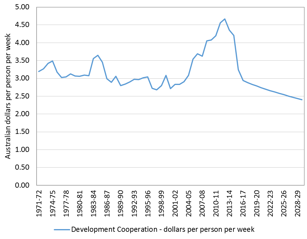
One factor that could be added to the analysis of “the way we were” is that Australia’s population has increased from 13 million in 1970 to nearly 24 million currently. The population growth rate has been higher than the aid growth rate. So, for every person in Australia, we are actually getting meaner. This is shown in the graph below (using constant 2015-16 prices).
On average, through the government, we used to contribute the equivalent of a bit over $3.00 per week in the 1970s. After an encouraging upwards blip during the creation of ADAB and a recommitment to aid in the early 1980s, funding dropped to slightly less than $3.00 per week on average for the next two decades. This is well below the price of a cup of coffee that each person is being required to contribute every week to meet all of our development interests (both humanitarian as well as hard-headed national interests, with aid being the cheapest form of defence – and I agree with the comment made by Janet Hunt at the post-budget aid breakfast forum that we should probably refer to ‘development cooperation’ rather than ‘aid’).
At its height, we reached the figure of $4.67 per week for each Australian in 2012-13. The figures are extended through to 2030 to highlight the implications of the government’s announcement that aid levels will be frozen at levels just to compensate for inflation. Population growth is based on the mid-case population scenario used by the Australian Bureau of Statistics. We’ll drop from the 2015-16 levels of $3.25 to below $2.50 per week per capita.
Figure 1 Development cooperation (Australian dollars per person per week)
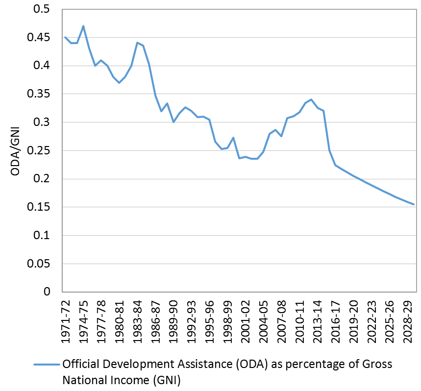
 Adding to this story of growing meanness is that on average Australians have become significantly richer. In 1970, through the government we gave about 45 cents out of every 100 dollars that we earned as a nation to development cooperation. By 1989, we were down to 30 cents for every 100 dollars. The aim of the previous government (and the previous opposition) was to lift this up to 50 cents (the 0.5% of GNI target). We struggled to 34 cents – still less than half of the target of 70 cents recently reached by countries such as the UK. As shown in the graph below (using growth forecasts from the government’s Intergenerational Report), with the massive aid cuts, we are down to 25 cents already, with current policy settings sending us on a path downwards to only 15 cents for every 100 dollars by 2030.
Figure 2 Development cooperation relative to income (ODA/GNI)
 As I mentioned in my introduction to the 2015 aid budget breakfast, from the perspective of someone who has sat on both sides of the budget fence as a loyal public servant, the cuts to the development cooperation budget are reprehensible. With the bipartisan political agreement to move towards the 0.5% target prior to the last election, I hoped we had turned a corner. But instead we are back to the way we were – a mean country that is getting meaner.
Paul Flanagan is a Visiting Fellow at the Development Policy Centre.


