
I have documented in the past on the Devpolicy blog the dramatic rise of remittances, which have now surpassed $US540 billion a year (more than ODA flows by a factor of 2.5). Now, for the first time, an awesome visualisation (drawing on data from The World Bank and OECD) shows the evolution of remittances around the world since 1970. Put together by a team at TagesWoche, a German-language online newspaper, the visualisation shows how huge and broadly spread remittances have become (particularly in the past two decades).
Click on the image below to view the visualisation.
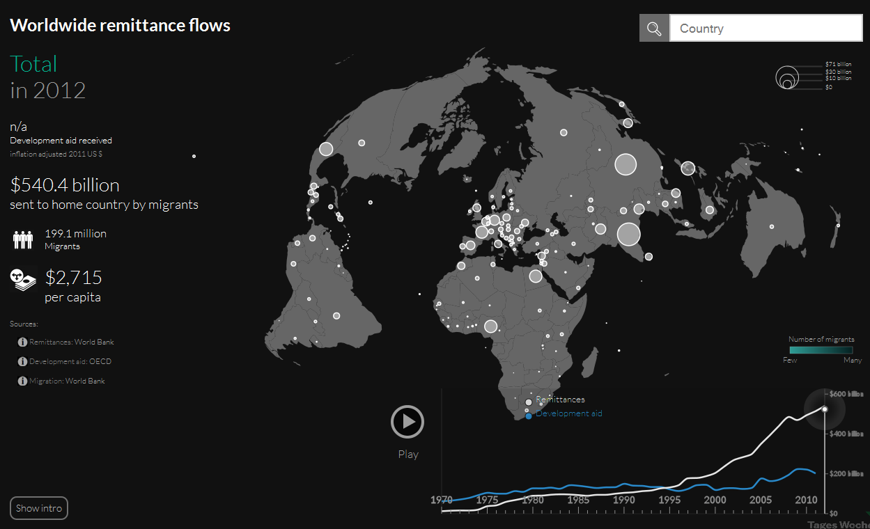
The authors highlight that between 2000 and 2012 remittances have soared from US$204 billion to US$540 billion (with at least another US$250 billion estimated to be sent through unofficial channels). Average payments per migrant are also estimated to have doubled in the past ten years. Make sure you also take a look at the time-series data for individual countries to see how remittances have evolved over time.
While growth in remittances has exploded, competition in the remittance-sending business hasn’t. The cost of sending remittances remains stubbornly high, globally averaging 9.05%. The most expensive corridor in the world, according to the World Bank, is South Africa to Malawi where it costs $US48.17 to send $US200. The World Bank and other agencies (see paragraphs 56-59 of this report) are looking for ways to bring costs down, in line with a G20 commitment to reduce the global average cost of sending remittances to five per cent by 2014, which could save up to $US16 billion a year. One approach is to set up web sites that help migrants identify the cheapest way of sending funds, like SendMoneyPacific, which is supported by the Australian aid program. With transaction costs as high as they are, surely this is a worthy objective. And with remittances as important as they are to our Pacific neighbours, it is to be hoped that Australia will pursue it when it takes the G20 reins.


Hi Jonathan,
Many thanks for your informative blog. My company, Developing Markets Associates (DMA) manages the SendMoneyPacific and SendMoneyAsia websites that you have referenced in your article. I thought I’d add a couple of points about the positive impact that government and donor supported impartial websites can have.
Thank you for highlighting the role played by migrant focused remittance comparison websites. SendMoneyPacific has been online now for nearly 5 years. Over that period we have recorded a fall in remittance costs levied by Money Transfer Operators in some of the more competitive remittance corridors of over 50% (e.g. MTO costs from Australia to Samoa are down by 58%). SendMoneyPacific has been able to help to reduce remittance costs, increase transparency and thus take up of formal channels as a consequence of the strong government support that AusAID and New Zealand’s MFAT New Zealand Aid Programme have been able to provide.
This support has helped to make the website a household name in many Pacific communities in Australia and New Zealand, and now the USA, as well as across the Pacific islands. Over 66,000 Pacific people follow SendMoneyPacific on Facebook and regular interaction with migrants at community events, on radio shows and in many other ways, has helped to encourage use of lower cost products and new remittance technologies.
AusAID recently provided funding for the launch of a sister website, SendMoneyAsia, which is now helping Asian migrants to make informed choices for remittances when sending money home from Australia to Asia.
SendMoneyPacific has benefitted from increasingly proactive regulators who have helped to pave the way for new low cost remittance products and technologies (mobile, online, prepaid card) to be launched and adopted by migrants. Which in turn, is helping to generate competition with the more established banks and MTOs in the region.
I have just discovered that the Guardian put together a similar visualisation earlier this year. While it doesn’t provide time-series information like the visualisation discussed above, I think it does a better job mapping where exactly money flows between countries. The way it visualises migration patterns is also very interesting!
While less impressive, the International Organisation for Migration has a visualisation that tracks people movements.
Perhaps it’s obvious, but it’s interesting to see how the remittance flows compare to the movement of people.
Great visualisation. Good detail. But are those ODA figures accurate?
$250 billion sounds way too high, see this story from The Guardian, which mentions a figure of $133 billion, nearly half of the figures above.
A good question Jason. The authors of the visualisation must have been incorporating more than just ODA in their calculations of development flows (notice they call it ‘development aid’ not ODA). Still, when looking at their source of development aid the numbers still don’t quite add up. I would have to do some more digging into it but overall I still think the visualisation does a great job in showing how remarkable remittance and migration patterns are. Regards.
If they were using data on Official Development Finance (ODF), as their reference indicates, that would have delivered a too-low total ($US151 billion in 2011) and also would have included some non-concessional flows, since ODF is broader than ODA. However, even if they’re being a bit sloppy with the term ODA, they’re in the right ball park. If you look at the OECD Development Assistance Committee (DAC) reporting tables for 2011, while net ODA was only $US134 billion, you can see that gross ODA disbursements were $US149 billion (table 13), grants by NGOs were $US31 billion (table 2), and ODA from non-DAC donors was at least $US13 billion (tables 33 and 33a) and probably much more. So gross concessional flows to developing countries from all sources were probably at about the level they estimated — i.e. a bit above $200 billion.
Cool, thanks Jonathan, Robin.
And whatever the actual figures, given that unofficial flows would boost the total remittance total to around three quarters of a trillion dollars, the main point they are making still stands, that:
People are paying a lot more than countries.
Impressive level of detail too – I was even able to get a result for Samoa!