As Australians’ income levels have increased over the past decade, so too have their level of public donations. Our previous blog post looked at this using income data from Australia’s international development Non-Governmental Organisations (NGOs). This post takes a different perspective, using data on household giving.
Specifically, we analyse the recent growth in Australian public donations by different groups in society over the period from 2003/04 to 2009/10. We break down donations by household income, wealth, geographic region and age. This analysis relies on results from the two most recent Household Expenditure Surveys (HESs), conducted by the Australian Bureau of Statistics (ABS) in 2003/04 and 2009/10.
As we are reliant on expenditure variables listed in the ABS HES surveys, the definition of “public donations” is not restricted to donations to international development NGOs. Rather, for the purpose of this analysis, “public donations” includes any monetary donation to a charity[1], but does not include donations to religious groups or family and friends.
Analysis of aggregate donations
The data confirms that from 2003/04 to 2009/10 there has been overall growth in public donations not only in monetary terms, but also in terms of percentage of income. In 2009/10 Australian households donated, on average, 0.25% of their weekly gross household income to charity, compared to 0.18% in 2003/04. This corresponded with an increase from the average yearly donations of $125 to an average yearly donation of $222 (in 2010 prices), representing a real increase of 77% over this period.
The implied total giving in 2010 is $2.0 billion, using the 2011 Census figure of 9.117 million households [2].Giving in 2010 to development NGOs was just under $0.9 billion (see our first post). Most of this would come from households. This would suggest some 40% of all household charitable donations made by Australian households are to development NGOs.
Donations by income quintile
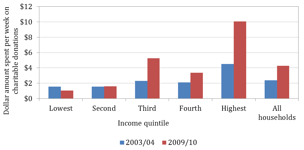
As illustrated in Figure 1, there has been an increase in the dollar value amount donated across all income quintile groups[3] except for the lowest income quintile. The highest income quintile had the largest increase in donations, of 122%. Although the third income group also experienced a large increase, the 2009/10 data on the third income group is not sufficiently reliable to draw firm conclusions.
Figure 1: Weekly expenditure on charitable donations by income quintile, 2003/04 — 2009/10 (constant 2010 prices)
 Source: ABS HES 2003/04, ABS HES 2009/10, author’s calculation
Note: 2009/10 data point for the third quintile does not meet reliability standard of having a standard error of < 50% of the estimated value, based on ABS guidance.
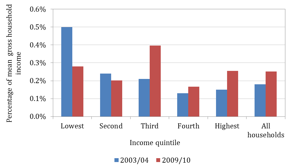
Figure 2 below indicates that the percentage of income donated to charity has not increased in all income groups, over the period considered. For example, in the lowest and second-lowest income quintile groups the percentage of gross household income donated to charity decreased between 2003/04 and 2009/10. Interestingly, despite the decrease in their donations, people in the lowest income group continue to donate the highest percentage of their income to charity (ignoring the unreliable 2009/10 estimate for the third quintile). The highest income group was the next most generous group in 2009/10, donating 0.25% of their gross household income. However, this has not been consistent over time, with the highest income group donating much less of its income in 2003/04.
Figure 2: Percentage of gross household income donated to charity by income, 2003/04 — 2009/10
 Source: ABS HES 2003/04, ABS HES 2009/10, author’s calculation
Note: 2009/10 data point for the third quintile does not meet reliability standard of having a standard error of < 50% of the estimated value, based on ABS guidance.
Donations by wealth quintile
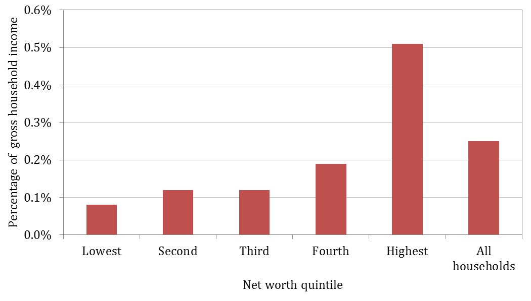
Although there does not appear to be much variation between the income quintiles presented in Figure 2, there is more than one way to measure affluence. Figure 3 uses overall wealth instead of income, and shows a much clearer positive correlation between affluence and generosity. For example, those in the highest net worth group gave 0.51% of their mean gross household income in 2009/10, which is more than double the percentage given by those in the highest income quintile group during the same period. It is also significantly larger than the donations by the fourth net worth quintile group, the second highest net worth group, who donated 0.19% of their gross household income.
The difference in the patterns observed in Figures 2 and 3 serves to remind us that, although we may often think of people with high incomes as also being wealthy, this relationship only partially holds. Further, it illustrates that the distinction is quite important when it comes to charitable donations; higher wealth, rather than higher income, is associated with greater generosity, where generosity is measured by the portion of income donated.
We note that the analysis here is limited to the 2009/10 data, as the wealth-based breakdown of the 2003/04 data is not provided.
Figure 3: Percentage of mean gross household income donated to charity by household net worth, 2009/10
 Source: ABS HES 2009/10, author’s calculation
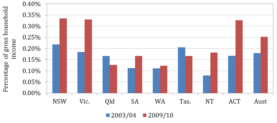
The geographic breakdown of donations in Figure 4 suggests that individuals from the ACT and NSW donated the greatest percentage of their gross weekly income in 2009/10 (ignoring the unreliable estimate for Victoria). Individuals from Western Australia and Queensland donated the least as a percentage of their income in 2009/10 despite the economic booms in both states during this period. In particular, Western Australia is one of the richest Australian states in terms of both income and wealth, but lags behind in terms of donations as a portion of income.
Figure 4: Percentage of gross household income donated to charity by state and territory, 2003/04 – 2009/10
 Source: ABS HES 2003/04, ABS HES 2009/10, author’s calculation
Note: 2009/10 data point for Victoria does not meet reliability standard of having a standard error of < 50% of the estimated value, based on ABS guidance.
Donations by age group
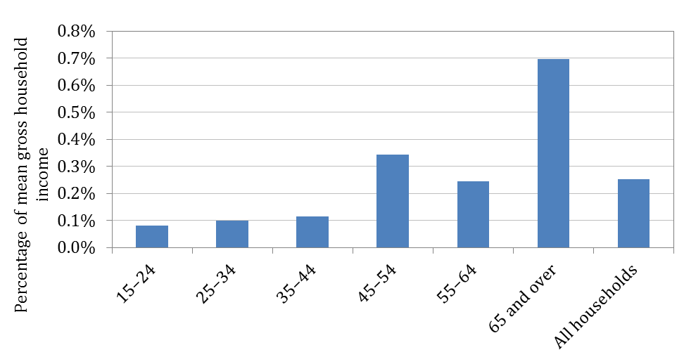
The data on donations by age group is limited to the 2009/10 financial year. Although the data is unreliable for the youngest and oldest age groups, Figure 5 does suggest that older individuals tend to donate more. Since individuals generally accumulate wealth over their working lives, this is consistent with the conclusion from Figure 3 that generosity is influenced by wealth. The 45-54 age group donated the highest portion of income, at 0.34% (ignoring the unreliable estimate for the 65+ age group).
Figure 5: Percentage of mean gross household income donated to charity by age, 2009/10
 Source: ABS HES 2009/10, author’s calculation
Note: Data for the ‘15-24’ age group and the ‘65 and over’ age group do not meet reliability standard of having a standard error of < 50% of the estimated value, based on ABS guidance.
Summary
Overall, the data suggest that the level of public donations varies largely between different groups in society as defined by income, wealth, location and age. A theme running through the various charts is that, as expected, richer people donate more. However, the relationship is a complex one. Figures 2 and 3 show that it matters how affluence is defined; asset-rich people are more likely to donate a higher portion of their income than income-rich people, and these two groups do not perfectly overlap.
The data also indicates that there has been an overall increase in public donations in Australia, both in real dollar terms and as a percentage of income, between 2003/04 and 2009/10. However, it is only households with higher incomes that are giving more as a percentage of their income; lower-income households have on average reduced the portion of their incomes that they donate. It is still not the case though that the richer (in terms of income) are more generous than the poorer, though note that this analysis is in terms of gross income. A very different picture might emerge if the analysis was done using post-tax income
The geographical analysis suggests that Western Australia stands out due to its low donations as a portion of income in 2009/10 accompanied by high income and wealth in the same year relative to other Australian states and territories. Queensland residents similarly donate a small portion of their income on average, although their income and wealth was a little below the average of Australian states and territories in 2009/10.
Overall, the results can be interpreted in different ways. Optimists can point to the fact that Australians are giving almost twice as much in charitable donations as they were a decade ago, even after inflation. Pessimists will note that even with that increase the average individual donation is just $1.60 a week (using the Census figure of an average household size of 2.6 persons), which is about the amount we spend on our pets.
[1] The survey variables used are ‘cash gifts, donations to charity not elsewhere classified’ and ‘cash gifts, donations to charity not further described’.
[2] This is quite similar to the figure for donations arrived at using data on tax deductibility which was $2.2 billion for 2010-11. However, these two figures are not comparable: the tax office figures will include donations from companies and to religious groups; and not all household donations are provided (or claim) tax deductibility.
[3] Income quintile groups defined by gross weekly household income (pre-tax).




A more interesting figure is how stable donations to international NGOs has been over the past 50 years (adjusted to size of economy) being about 0.03% of GNI, based on ACFID reporting figures.
On Lukes ‘giving’ figure the 13% is 13% of what. The Industry Commission report of the mid-1990s had international NGOs as being about 40% of the total, but that was for charity (note domestic charities get very high amounts of government funding, much higher than international charities) . I think the 13% figure includes religious donations, sporting donations, and a lot of non-charity stuff.
Just further on your point, Garth, the 2005 survey you mention has household giving to international development NGOs at $758 million (13.3% of $5.7 billion) for 2004, excluding the Tsunami response. But reported donations by Australian international development NGOs prior to the Tsunami are about $400 million (see our first blog: https://devpolicy.org/the-other-scale-up-australian-public-donations-for-development-over-the-last-decade-20130829/), including donations from business. This does suggest a lot of over-reporting of our generosity in that 2005 survey.
You might be right Stephen – certainly the ‘real time” household expenditure survey should be the more accurate – although it still seems very unlikely to me that aid NGOs are receiving 40% of the charitable dollar when you think of all those health, sporting, environment, indigenous and domestic antipoverty charities plus unis and private schools.
Also I don’t want to believe that our nation spends more on stationery than on giving to charities (an average of $4.42 compared with $4.26 per household per week in 2010) . Maybe it is all those letters saying “Don’t send me any more requests for money I will give when I can.”
You might be right about people forgetting their generosity Stephen.
As far as I can tell the Household Expenditure Survey asks people to record expenditure in a diary during a two week period based on the date they were first contacted by ABS. If the period covered did not cover a peak giving time eg just before the end of the financial year, then it is likely that donations would be undercounted. ABS does also ask respondents about big infrequent expenditure over the previous 12 months eg household appliances, car insurance but I don’t think they prompt for charitable giving.
In addition people may also be forgetting to diarise regular automatic bank or credit card payments.
Thanks Garth. I wasn’t aware of that report. You are right, 40% does seem high and $2 billion low. I’m sure part of the explanation is the difference between asking people how much they give as part of a much broader survey of their spending patterns, and asking people how much they give as part of a survey of giving. In the latter, respondents might exaggerate how much they gave; in the former, they might give more accurate answers, or perhaps they forget how generous they are?
I think it is unlikely that 40% of private charitable donations are going to international aid, given the wide range of other types of charity and the understandable priority of giving close to home. The 2005 Giving Australia report, probably the most comprehensive analysis to date of Australian charitable giving, estimated [pdf] that donations to international aid made up around 13% of total private giving – that seems more likely to me. That report also said that $5.7 bn was contributed by individuals to charities (including religious groups) in that year. While one cause of this higher total is the inclusion of religious groups, I suspect that there are significant differences in methodology between the Household Expenditure Survey and the Giving Australia survey.
While the ubiquity of large screen TVs, BMWs, pricey schools and overseas holidays amongst Australians suggest that we are probably not as generous as we think we are, I can’t believe we are so stingy we only give $2 bn a year to all charities.