I was sitting in a quiet meeting room in Port Moresby when my reliably silent phone started ringing. I hung up. It rang again. With everyone looking at me, I tried to figure out how to turn it off.
It wasn’t until I checked my emails later that I worked out why the phone had gone rogue. Emails from journalists and development friends about the massive increase in the New Zealand aid budget. There was even an email from my mother, excitedly relaying the news: a $714 million New Zealand dollar boost over the next four years. To put that in perspective, at the end of the 2017 financial year, the entire New Zealand aid budget was less than $600 million NZD. That night I started teasing Australians that I couldn’t see why everyone was making a fuss about China; New Zealand was the real threat.
You’ll imagine my disappointment when last weekend, back in cold, cloudy Canberra, I downloaded the data from Treasury’s website and crunched the numbers, only to find the increase wasn’t $714 million. Or, to be more exact, the $714 figure was the cumulative difference across four years between the new government’s aid budget and a counterfactual budget of no increase under a hypothetical National government. It’s the sort of maths that you find only in press releases and econometrics textbooks.
Still, as the chart below shows you, even with the cumulative, counterfactual, and hypothetical stripped from the budget, there is an sizeable increase on the books. Compared to the previous government, in which the aid spend stumbled up and down, the planned trajectory is a happy change.
Even with inflation taken into account, if spending goes as projected, the aid budget will be 15% higher in the 21/22 financial year than it is in the current financial year. Assuming the increases occur as planned, they will be part of five consecutive years of increases to the aid budget. (Increases, even with inflation accounted for.) If OECD data are anything to go by, the last time New Zealand had a five-year run of real increases was under the Kirk government in the 1970s.
Actual and budgeted aid, New Zealand (NZD, million, nominal)
Data and sources, along with inflation-adjusted figures, can be downloaded as a spreadsheet here.
Intriguingly, you’ll notice that the largest leap in the upwards trend is actually the one that’s occurring right now in the financial year that’s coming to a close. This is a product of the aid program hurriedly catching up on previous under-spends so as to use up its previous three-year allocation. I thought this wasn’t going to happen. It looks like it has. (I say “looks like”, because this is still only an estimated spend.) Nevertheless, I’m happy to admit I was wrong. I’d love to know what the money was spent on. For now, the aid program deserves credit for catching up.
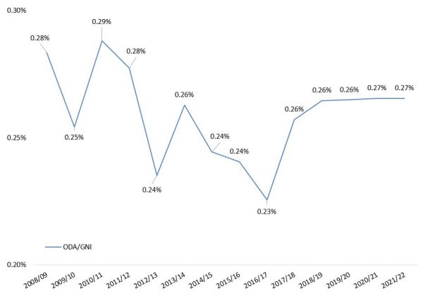
Given New Zealand has been languishing with Australia at the stingier end of the OECD’s Aid/GNI tables, over the weekend I also looked at what the increase would mean for aid as a share of GNI. Using GNI projections from Treasury this is what I found. (The data are in the spreadsheet linked to above.)
Actual and projected aid/GNI
The downward trend has been reversed, which is great, and aid/GNI now looks set to increase. Although the increase is only modest.* What’s more, page 14 of this budget document suggests that the budget for ODA includes money that New Zealand will give to countries such as Cook Islands even if those countries cease to be officially eligible for ODA under OECD rules. This means New Zealand’s actual standing in international league tables may be somewhat lower than budget data suggest.**
Still, even though the aid increase wasn’t quite as massive as it was made out to be, and even if it won’t make us Sweden, it’s very worthwhile. New Zealand’s new government, its Foreign Minister and MFAT all deserve credit for that.
The next challenge will be to spend the money well. I’ll cover that in a follow up blog post.
* Those of you who read reporting at the time will note that the government predicted aid to be 0.28% of GNI by 2021/22; the slight difference between their prediction and mine is, I think, that I have more recent GNI data.
** At this point it is unclear when countries such as the Cooks will cease to be ODA eligible.


Thanks for this, it is a very clear explanation for us non-economists. As you say, the real questions are around how this money will be spent – we will all be watching that with interest
Thanks Tess!