Today’s attention is on the headlines–‘Aid promise on track to save thousands of lives‘, ‘Aid granted $1.9bn boost‘ or ‘Hockey puts Bishop on the spot‘. But next week, once the excitement has subsided, it will be back to work on the business of delivering the aid program. So this post looks past the headlines and focuses on the detail–AusAID’s Blue Book, a compendium of charts, tables and priorities. Does it give us a clear picture of how development aid will be be spent?
The budget team at AusAID have done a terrific job improving the structure and readability of the Blue Book. There are some useful charts and tables providing insight into the budget. The colour PDF version of the Blue Book looks great, especially on an iPad, (though I am very reliably informed that budget rules prohibit AusAID from publishing the hardcopy in colour.)
What’s different about this year’s Blue Book?
There are diagrams explaining aid allocations and the relative significance of Australian aid. For people who are new to the Blue Book, these are a good starting point before diving into the detailed estimates of the aid budget. (For example, see Diagrams 3 and 4 on pages 6 and 7).

There is more detail in the tables. For example, there is a breakdown of aid delivered by other government departments (Table 3 on page 114). From the summaries of total ODA by partner country and AusAID country programs, it is possible to infer how much aid in each country is delivered by other government departments. This information is also offered in individual country summaries.
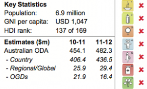
The biggest improvement has been made to the country summaries. There’s more information (maps, MDG scorecards, key statistics) and information on each country program is well-structured, with summaries of priority areas and Australia’s response. Importantly, the latter includes a much clearer definition of the results that the aid program will be held accountable for delivering. (For a good example, see the summary of the PNG program on pages 13 to 14).
What areas could be improved?
While this year’s Blue Book is better, there are a number of areas where it could be improved to enable an even clearer picture of how aid will be spent.
First, while the country tables are clear, the sectoral allocations require some inference (Chapter 4). The sectoral spending has been tweaked and is aggregated in a slightly different way than previous budgets–health now includes water and sanitation, and governance has been split into two categories–so seasoned aid watchers will need to be mindful of this.

The main challenge with the sectoral numbers is finding them. If you like sudoku, then you’ll enjoy piecing together the sector spending. There’s a chart for the breakdown of ODA by sector (page 79), but no corresponding table, so no numbers. Some of the sector spending numbers are in the text (throughout Chapter 4), but you have to hunt for these and they don’t include previous years for comparison. If you want to get a get a dollar breakdown of spending within sectors, you have to multiply the sub-sector shares (from various pie charts) by the total sector spend. This is a task for people with patience.
Secondly, the budget document is light on information on the multilateral program. For example, there was a major replenishment last December of the World Bank’s concessional lending arm, the International Development Association. Australia will contribute $830m over the next three years, yet the replenishment barely gets a mention and, as far as I can see, only the number for the 2011-12 contribution ($167.9m) is mentioned. As this blog has discussed before, Multilateral aid is an important channel for delivering aid, and it justifies more analysis and greater detail.
Thirdly, while the country summaries contain clearer results, they don’t say anything about how much is being spent on each priority. So there is no way for you to see how much each priority costs or understand value for money in delivering results.
The trajectory is right though. AusAID has a clear understanding of the theory of aid delivery chains – linking funds to activities and results – and we are provided with a good overview of the concept of value for money (See page 120). AusAID is also committed to improving aid transparency. It has signed the International Aid Transparency Initiative and plans to release more project-level information as part of its implementation of the Freedom of Information Act. AusAID is also overhauling it’s website. So we can expect more clarity on funding and activities as the year progresses and in next year’s Blue Book.
Read and share feedback
For now, I’d encourage you to read through the Blue Book to consider how Australian aid is being spent. AusAID is open to feedback, so if you have ideas for improving the budget documentation, please post your comments and we’ll pass them on to the budget team.
Matt Morris is the Deputy Director of the Development Policy Centre and a Research Fellow at ANU’s Crawford School.
 Update: Sector spending sudoku results
Here is an estimate of the breakdown of sector spending in the 2011-12 aid budget based on information in the Blue Book.
The total aid for each sector is from the text in Chapter 4 and the sub-sector breakdown is calculated by multiplying these by the sub-sector shares from various pie charts. A key point to stress is that because the calculations are based on the percentages from the Blue Book there will be very slight rounding errors in the estimates.
AusAID’s departmental costs ($283m) are from Table 1 on page 3 and ‘other’ ($282m) is calculated as a residual. It is possible that AusAID may have apportioned its departmental costs across the sector spend. In which case the residual ‘other’ would increase by $283m to $565m.
Hope this makes sense and if you have any questions, please post a comment or send me an email.
Matt


