
As recently blogged, the Australian launch of UNDP’s 2010 Human Development Report, The Real Wealth of Nations: Pathways to Human Development, took place at the Crawford School on 13 December 2010.
Bob McMullan, present, said a couple of things about Australia’s nearest neighbour, Papua New Guinea. First, that AusAID’s Country Program to PNG is still the largest in the aid programme ($415m to Indonesia’s $325m in 2010-11). Second, that as endorsed in 2009, the fifth priority of the post-Howard PNG-Australia Partnership for Development is ‘developing and implementing a national statistics roadmap’ in PNG.
In context, PNG scarcely reports a single statistical indicator accurately. This leads to nonsense in PNG’s entries in the HDR and a blank against many of the research topics ANU scholars pursue.
For PNG, the topic of food security is well-covered through national nutrition surveys, collaboration between researchers at the ANU, PNG’s National Agricultural Research Institute and elsewhere (a recent synthesis is given in Food and Agriculture in Papua New Guinea, ANU ePress 2009), and papers in the PNG Medical Journal. Despite well-documented, localized food shortages, ‘daily calorie supply’, was reported for PNG at around 100% of requirements in HDRs in the 1990s. After 2000, ‘undernourished people as a % of total population’ took its place. This was reported at a belt-tightened 26-29% until 2004, then at a less serious value, and not at all from 2007.
Did Papua New Guineans feast through the 1990s only to starve in the 2000s? No, it is just any attention on the concept of ‘poverty’ in PNG is met with such populist outrage that it is awfully difficult to get empirical data from local reports into international ones. Income poverty – living on less than $1.25 a day – was last reported in the HDR at 35.8% of the population (in 2009) and is now also missing from the current report.
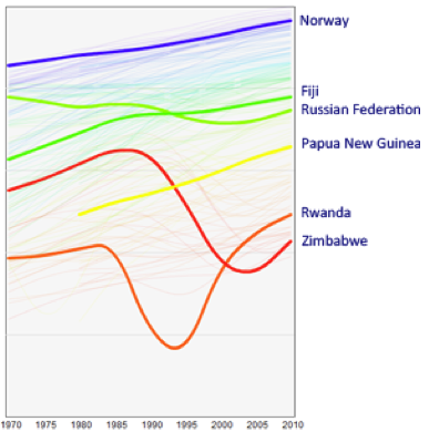
This suggests I might agree with Ron Duncan’s dismissive assessment that the HDR is an exercise in naming and shaming poor performing nations. But I come to the opposite conclusion: it has become a back-slapping exercise in which everyone congratulates everyone else on how well they’ve done while the poor … well, just stay poor. Life expectancy, a central plank of the HDR indicators, is a good example: with a very few well-known exceptions, it always goes up in the HDR , and PNG’s trendline is no exception (Fig. 1).
 But PNG’s figures for life expectancy in the HDR are made up. The only calculations of life expectancy in PNG from nationally collected data are those of the demographer Martin Bakker: 49.6 years and 54.2 years in the 1980 and 2000 censuses respectively, figures below all points on the detailed HDR graph (Fig. 1). With the HIV-AIDS epidemic taking hold in PNG in the last decade, life expectancy might be going down again: we really have no idea.
The ‘decline’ of the maternal mortality ratio (deaths of women from pregnancy-related causes/100,000 live births) is another example of Dr Pangloss at work. The HDRs claim a remarkable fall in PNG, from 900 to 250 over the 20 years (Fig. 3).  But with no death registration in PNG, where have the figures come from? They are also made up. Glen Mola of the Port Moresby General Hospital, PNG’s expert in these matters, currently accepts a figure of between 700 and 900, for an appalling lifetime risk for women of dying from pregnancy of 1 in 20. PNG has gone nowhere.
Who cares, or who should care, if a national government will not?
- Donors. Their citizens may reasonably hope for some statistical evidence of their largesse, not idleness in the ministries that aid targets or, worse, a trowelling over of inconvenient discoveries. But even as ministers announced the aid priority for a statistical roadmap, the 2010 census was being undermined. The Census Office eventually conceded that the government had not allocated funds (Post-Courier 7 Jul 2010) and has said it will try again next year.
- Scholars. Many in the College of Asia and the Pacific, and their collaborators in national institutions in PNG, work hard in each of the HDR indicator areas. Other poor they have taken an interest in but who don’t feature in the 2010 HDR include refugees and victims of violence. Diana Glazebook (Permissive Residents: West Papuan refugees living in Papua New Guinea, ANU ePress 2008) could well be cross that the 2791 residents of the East Awin camps in the 2000 census – who haven’t gone anywhere – were reported as “0.0 thousands” in 2010. The contributors to Conflict and resource development in the Southern Highlands of Papua New Guinea (ANU ePress 2007) and Civic Insecurity: Law, order and HIV in Papua New Guinea (ANU ePress 2010) will shake their heads to see the missing indicators on ‘conventional arms transfers’, homicide, robbery and assault rates.
- The international community. Helen Clark says in the foreword this year ‘not all the trends are positive, as we know too well’. She’s not kidding. If PNG had the health profile of Fiji – by no means an HDR saint – something like 8000 excess deaths among under fives and 1000 excess deaths of mothers would be saved in PNG, and with Fiji’s homicide rate, perhaps another 1000 murder victims, each year. These are big numbers – 350,000 avoidable fatalities since Independence, more than the population of Vanuatu, or Oro and New Ireland Provinces combined. But apart from teacher’s pet Sweden falling back by a minuscule 0.04, tsk tsk, the only country to go backwards on the Human Development Index in 2010 was international whipping boy Zimbabwe. For the rest of the backsliders, PNG included, face was saved by simply not reporting bad news.
I like the HDR a good deal, but the international community owes it to the poor, the victimised and the needless dead to do a better job when governments contrive, by omission or commission, to erase them from statistical view.
John Burton is a Research Fellow, Resource Management in Asia-Pacific Program, at the Crawford School, ANU.


From Glen Mola’s note on maternal mortality:
Thanks John, fair enough…
I understand what you are talking about but the HDR involves all 192 UN Member States and rounding up better data from the 30 smallest ones is more a question of quality control and informed peer review.
I think I’ll have to agree with Laurence here, UNDP has to bear some of the blame for inaccurate statistics. I run a multimedia company in PNG and we have been invovled with SMS marketing campaigns for the last 6 years, even before Digicel came into the market.
Last year we recently approached UNDP here in Port Moresby about using SMS for awareness and statistics for health data. Specifically in relation to health statistics we proposed a wheel chart that could show a specific code in relation to a health statistic being reported which could be sent as a text to a specific given short code.
You can have a look at the proposal here at page 4: http://www.masalai.com.pg/projects/pdfs/sms_health_communications_undp_10061.pdf
However after sending in the proposal last year we never got a response about it from the person responsible. We found out just last week that she has now left for further studies so I am trying to work out again who to speak to at UNDP since her position now needs to be readvertised.
To be honest its not totally UNDP’s fault if an employee decides to resign, I guess my point is more that we have the technology to make data more accurate and I would like to know if anyone readung this could maybe point us in the right direction to see if we can make this work.
On a technical level we work with http://www.mobimedia.com.au who are the SMS platform suppliers to Digicel for all their countries in the South Pacific. So we have the presence and technology to implement this SMS Data Collection System in nearly every network in the South Pacific.
John Burton, could you please have a read of my document and advise on your thoughts.
Regards,
Emmanuel Narokobi
Masalai Communications
UN statistics are notoriously flaky, for reasons unknown to me. The FAO figures on land use and land use intensity in PNG are just plain wrong, yet year after year they are reproduced. Below is an extract from Food and Agriculture in PNG, Part 1, People, Land and Environment by Bryant Allen and Mike Bourke pp35-46.
I said that “it is awfully difficult to get empirical data from local reports into international ones” and I stand by this. You may well have put your finger on it in respect of UNDP procedures, but it remains the case that half the battle lies within people’s minds. A returned post-grad reacting to the latest airing of a report on poverty in PNG told the Post-Courier in 2008 “I have just returned from ANU (Australian National University) after completing my studies. These so-called experts on PNG affairs continue to amaze me.” Well obviously not enough, we might feel.
The late Susy Bonnell told of an instance when she worked in Welfare in PNG years ago. The annual figure for infant mortality, I think, was handed to the secretary to be included in statistics to be forwarded to UNDP or a like agency. “It’s gone up since last year, change it” was the reply. The PNG media are not much help, as most journalists appear number blind. (One wrote a story about a 50 metre high dwarf last year.)
Whowever else has a hand in this, it’s intriguing that the line on the UNDP spaghetti graph is monotonic whereas the actual (made up) data (Fig. 2) at least wobbles up and down. UNDP is clearly at fault here for not ensuring that the smoothing doesn’t occur within its own reports.
You’re right that any mention of poverty in PNG is typically met with hostility but I’m unconvinced that this explains the failure for the HDR to report on the little empirical data that exist. I know of no instances of PNG government staff vetoing the inclusion of data from the report (though I’d be interested to hear of any, if you do).
The fault instead lies with the UNDP, whose data operations are overly centralized at headquarters in NYC, and whose country staff lack adequate knowledge of country-level data and are thus ill-equipped to report to headquarters on what data sources should be used in the report.