A much bemoaned fact about international aid is that it is volatile. Generosity waxes and wanes. Flows rise and fall. Aid shouldn’t be volatile – amidst the complexities of development, instability undermines effectiveness – but it often is. And so, with volatility in mind, I delved into the OECD’s aid databases to put the recently announced Australian aid cuts into perspective, and to find out just how often other donors have cut spending by 20 per cent in the space of a year – 20 per cent being the size of the cut to be inflicted on the Australian aid program next year (a cut that is itself just the first, albeit the largest, of a series of major cuts to occur over coming years).
To do this I took data for all OECD DAC donors for all years since 2001.1 Then, for each country, for each year, I calculated the change in its aid budget as a percentage of the previous year’s aid budget (i.e. a $1 billion dollar cut from a $5 billion aid budget equals a change of -20%).2 This enabled me to see just how common cuts as dramatic as those to be suffered by the Australian aid program are, and to find out whether they are commonplace or unusual amongst the community of donor countries (ostensibly at least) committed to giving aid well.
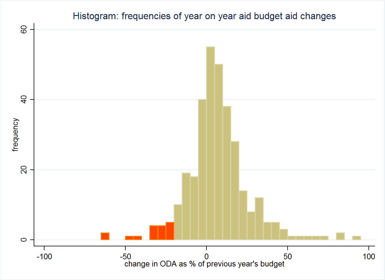
The answer to this question is clear in the chart below: cuts of the magnitude to occur to Australian aid are not common at all. The chart is a histogram. Its yellow bars show the number of instances in which individual DAC donors increased aid amounts or cut them by less, as a percentage of their aid budget, than 20 percent. Its red bars show the number of instances of cuts greater than or equal to 20 percent.3
 Of the 332 country years that data exist for since 2001, in only 16 instances have individual DAC donor countries imposed annual cuts to their aid budgets that were as large or larger in percentage terms than the amount Australia is gearing up to cut. What’s more, unlike in the Australian case, in some of these instances, the “cuts” were actually simply statistical artefacts – for example, United Kingdom aid ‘fell’ by 27 percent in 2007; however, this was only as a result of major debt forgiveness in 2006 that wasn’t replicated in 2007 and the actual physical aid program itself kept growing.
Even though we’ve been through a decade that saw the turbulence of the Global Financial Crisis, and even though we live in a world where aid volatility is more than we’d like it to be, cuts as substantial as those faced by Australian aid are unusual.
One possible retort to this is that Australia is living in unusual times: its senate is deadlocked, its iron ore is apparently of little worth any more, and it is plunging into debt. Perhaps such unusual circumstances justify cutting chunks off the aid budget? Perhaps other countries would do the same given the dilemmas Australia faces?
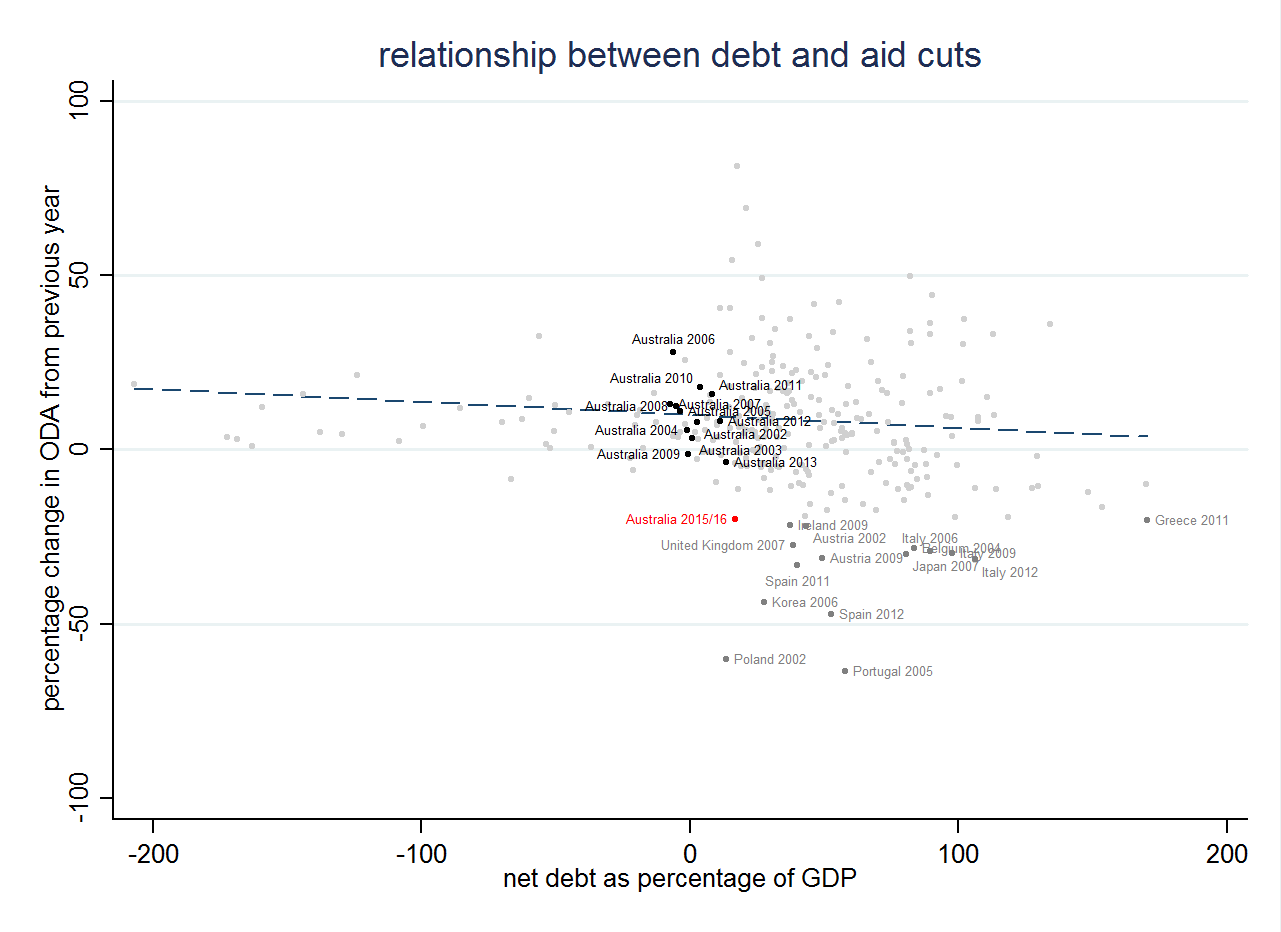
This sounds plausible. But it’s not, as the chart below shows. Each point is a given year for a given OECD DAC donor country. On the X axis is that country’s net debt as a percentage of GDP in the year in question (debt data comes from the IMF and is included in the spreadsheet linked to in the notes below). The Y axis plots the percentage change to the country’s aid budget in the same year (i.e. a value of 50 means the country increased its aid budget by 50 percent that year). Past Australian country years are plotted in black and labelled on the plot. The projected 2015-16 Australian situation (both aid cuts and anticipated net debt) is plotted in red (with debt taken from the MYEFO). All other country years are in grey, with non-Australian instances of cuts greater than or equal to 20 percent also being labelled in grey.4
 Of all the countries to have cut aid by more than 20 percent, only one, Poland in 2002, was less indebted than Australia is (and this cut appears possibly nothing more than a statistical artefact). Many other countries have endured much higher levels of indebtedness than Australia without slashing their aid budgets.
If you want, you can argue that Australia is on a road to ruin, worse is to come, and that something needs to be done. But by historical standards it is not a particularly indebted country. And to the extent its fiscal situation really is unsustainable, aid, which is only about 1.19 percent of government expenditure, won’t solve problems, which is why a number of considerably more indebted countries than Australia have left their aid budgets intact (as an aside, page 23 of the MYFEO shows that nearly twice as much money as will be saved over the coming 3 years through aid cuts will be lost to the repeal of the Minerals Resource Rent Tax).
Cutting aid as dramatically as Australia will is rare. And in Australia’s case, as the international comparisons suggest, it is slashing aid while still in comparatively good fiscal health. It’s hard to see quite how a nation that aspires to be a responsible global citizen can justify this.
Notes:
1. I chose 2001 as a starting year as my understanding is that OECD aid data become somewhat more reliable from that point. Also, the time around 2001 might be said to be the start of the modern aid era. Note, however, that I obtain very similar results if I extend my analysis back further. From 2001 until 2013 4.82 percent of country years saw aid cuts of greater than 20 percent. From 1990 until 2013 the figure was only slightly higher: 5.03 percent.
2. To allow for comparison with the upcoming Australian cuts, my calculations used nominal dollars in the donor’s currency.
3. Note that a very small number of donors have increased aid by greater than 100 percent in some years, these are not plotted on the chart. The data used for this and all following charts can be downloaded here. You are welcome to email me to discuss how to use the data.
4. OCED and IMF data are in calendar years, whereas the cut, and information on it and debt levels in the MYFEO, are for the Australian financial year. This difference in reporting periods has no impact on the substantive points of my analysis. There are only 15 labelled grey points on the chart (despite the fact, as I noted above, that there are 16 country years), where cuts of greater than or equal to 20 percent have occurred. This is because 2002 debt to GDP data are missing for the Slovak Republic.
Terence Wood is a Research Fellow at the Development Policy Centre. His PhD focused on Solomon Islands electoral politics. Prior to study he worked for the New Zealand Government Aid Programme.


Thanks Terence. I think these comparisons are very useful as they serve to give some context to these policy decisions. Australia has the sixth lowest debt/GNI of the 28 OECD donors, but will have the 19th least generous aid program once these cuts are implemented.