Australia and Portugal don’t usually have much in common, except good beaches and a somewhat competitive interest in the fortunes of Timor-Leste in the early years after independence. But, according to preliminary estimates of 2015 aid flows just released by the OECD, they share the distinction of being, in proportional terms, the two biggest aid cutters in 2015.[1]
As a consequence, Australia’s ranking among the member countries of the OECD Development Assistance Committee (DAC) has fallen significantly no matter how you measure it, as the chart below (from our Australian Aid Tracker website) shows. We’ve gone from 13th to 16th place in terms of the ratio of Official Development Assistance (ODA) to Gross National Income (GNI). That’s our lowest rank since 2009. In terms of ODA per capita, we’ve dropped from 11th to 14th place. As for aid volume, we went from 9th to 12th place. We have not ranked so low on the latter two indicators since 2008 and 2009, respectively. All up, this means we’ve dropped three places on each of these indicators of aid effort in the space of one year.
Total DAC aid held steady at 0.3% of total Gross National Income (GNI) but the average country effort—that is, the average of the ODA/GNI ratios of the 28 DAC member countries—increased from 0.39% to 0.41%, reflecting increases in the share of national income allocated to aid by some smaller donors. Aid from the EU countries combined accounted for 0.47% of their collective GNI, the highest share achieved to date, and a substantial increase from the 2014 ratio of 0.43%. Six countries—Denmark, Luxembourg, The Netherlands, Norway, Sweden and the United Kingdom—met the United Nations target to provide aid equal to at least 0.7% of GNI.
The OECD, by the way, happily notes that this latest record outcome includes a 4% increase in bilateral aid to the group of least developed countries, to $25 billion, describing this as ‘a slight rebound in aid after several years of diminishing flows to this group of countries’. However, as pointed out here, there had in any case been no evidence of a trend toward reductions in the aid receipts of the least developed countries. Moreover, there has been a marked trend toward not specifying the recipients of bilateral aid, which means that we have no idea how much aid is going to the least developed countries, or any other group of countries, from the now very large ‘unspecified’ pot.
It might be thought that the 2015 record was achieved by counting more onshore refugee and asylum-seeker costs as ODA. Most of the increase from 2014 to 2015 was in fact due to this but, according to the OECD:
… if these cost are excluded, net ODA still continued to grow by 1.7% in real terms.
This mirrors the situation in 2014, described in this recent series of Devpolicy Blog posts, when the real increase owed much to increased claims for onshore refugee costs, but would not have been completely cancelled by their exclusion.
Here’s an excerpt from the OECD’s useful detailed note on the performance of individual DAC donors:
Net ODA rose in twenty-two countries, with the largest increases recorded in Austria, Canada, Czech Republic, Germany, Greece, Iceland, Italy, Japan, Netherlands, Poland, Slovak Republic, Slovenia and Sweden. … By contrast, total net ODA fell in six countries, with the largest decreases recorded in Australia and Portugal.
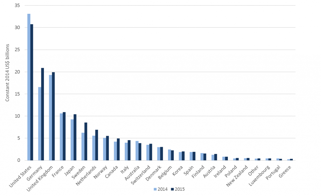
The following chart, constructed from the OECD data provided here, shows how the 2015 outcomes for individual donors compare with those recorded in 2014, with the four tiniest donors (Iceland, Slovenia, Slovak Republic and Czech Republic) lumped together as ‘Other’.
DAC donors’ ODA volume: 2014 vs 2015
As can be seen, Australia is now just a couple of notches above the median donor (Denmark in 2015). In calendar-year terms, and using constant 2014 prices and exchange rates to express the value of expenditures, Australia’s aid peaked at $4.8 billion in 2012, fell to $4.5 billion in 2013 and a little further to $4.4 billion in 2014, then plummeted to $3.9 billion in 2015. That calendar year, it should be emphasised, included only the first half of the Australian financial year in which an A$1 billion, 20% aid cut was applied.
Over the same period, Australia’s ODA/GNI ratio fell from 0.36% to 0.27%, as illustrated in the interactive chart below from the Australian Aid Tracker. The lowest ratio ever recorded was 0.25% under the Howard government, in each of the three years 2003–05.
[1] The OECD releases preliminary data on aggregate aid flows for a given calendar year in April of the next year, and final data disaggregated by recipient and sector the following December.
[2] ODA figures above are expressed in US dollars except where stated otherwise. For the purposes of inter-year comparison of aid effort, the OECD adjusts current prices to reflect both inflation and exchange rate movements. It therefore presents the 2015 outcome for all donors and individual donors both in current (2015) US dollar terms and in terms of 2014 prices and exchange rates. The 2015 outcome expressed at 2014 prices and exchange rates was $146.7 billion. The large difference between this and the current-price figure, $131.6 billion, reflects a substantial depreciation of DAC members’ currencies against the US dollar in the course of 2015. According to the OECD, this depreciation exceeded 15% in some cases.


